The Apple Music rebrand landed on October 21, and the story traveling with it is the story of how it was made. A transducer turned a short composition by Fred again.. and Nest Acoustics into physical vibration. That vibration went into a shallow bath of mineral oil,...
Most teardowns open with the logo, and Arc’teryx makes that tempting. The fossil skeleton is one of the most recognizable marks in outdoor gear: clean at any size, impossible to mistake for anything else, unchanged in spirit since the company stopped calling...
The McLaren rebrand arrived on September 23, and the loudest part of it is what left. The Speedmark — the papaya swoosh the company had carried since 1997 — came out of the primary mark. In its place sits a quiet lowercase wordmark with a small underscore tucked...
Most outdoor brands land on the same palette. Muted green, dusty orange, a gray that photographs well against granite. Topo Designs has run close to two decades on saturated red and blue instead, which makes the Topo Designs brand identity an easy thing to explain...
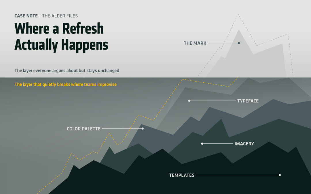
Brompton refreshed its brand identity in August. Studio Blackburn led the work. The folding-bike maker’s logo came through untouched, and so did the triptych symbol beside it. For a brand refresh that drew coverage across the design press, that is an odd thing to lead...
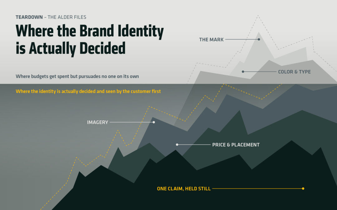
Ask a small business owner what made YETI work and the answer arrives fast. The films. The ambassadors. A marketing budget with no visible bottom. That explanation is comfortable because it puts the whole thing safely out of reach. It also skips the part worth...