
The Alder Files
Educational Articles

The McLaren Rebrand and the Cost of Looking Expensive
The McLaren rebrand arrived on September 23, and the loudest part of it is what left. The Speedmark — the papaya swoosh the company had carried since 1997 — came out of the primary mark. In its place sits a quiet lowercase wordmark with a small underscore tucked...

From the Field – Index, WA
Index sits about an hour northeast of Seattle, where the Skykomish cuts through and the valley walls rise fast enough to keep the floor dark most of the day. I spent two days on the trails above town last September with a couple of buddies, tracking black bear. There...

Brand Strategy Comes Before Design: What to Settle First
A brand strategy is only working if it can rule something out. The four decisions to settle before design begins.

Brand Typography: One Typeface Beats a Pairing
The first question in most brand typography conversations is which two fonts to use together. It is the wrong question, asked too early, and it sends the rest of the decision sideways. Pairing gets the attention because pairing is fun. Two faces, a contrast to manage,...

Logo Design That Survives the One-Inch Test
A mark gets approved at two thousand pixels on a conference room screen. It gets used at twenty-two pixels on a browser tab. Most logo design is judged in the first condition and lived in the second, and that gap is where a great deal of identity work quietly comes...
Topo Designs Brand Identity Teardown: The Discipline Behind the Color
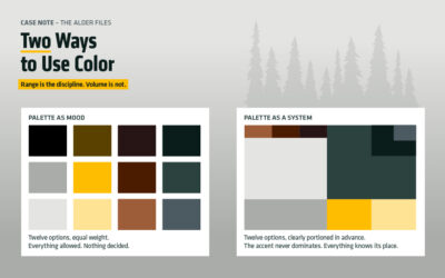
Most outdoor brands land on the same palette. Muted green, dusty orange, a gray that photographs well against granite. Topo Designs has run close to two decades on saturated red and blue instead, which makes the Topo Designs brand identity an easy thing to explain...

Brand Positioning: Why a Narrower Audience Builds a Stronger Brand
Most businesses approach brand positioning backwards. The instinct is to widen: describe the work in terms broad enough that nobody feels excluded, list every service on offer, choose a name and a look that would sit comfortably beside any competent competitor in the...

How Many Logo Concepts Should a Designer Give You?
“How many logo concepts do I get? One studio quoted three. Another place offered twelve for half the price. Is more better?” Fair question, and it comes up before almost every identity project starts. The honest answer is that twelve is a warning sign rather than a...

Visual Hierarchy in Brand Design: The Work Nobody Notices
A client reviews a new identity and the feedback goes straight to the logo. Then the color. Maybe the typeface, if they hold opinions about typefaces. Those are the parts a person can point at, and pointing is how most design conversations begin. Visual hierarchy in...