
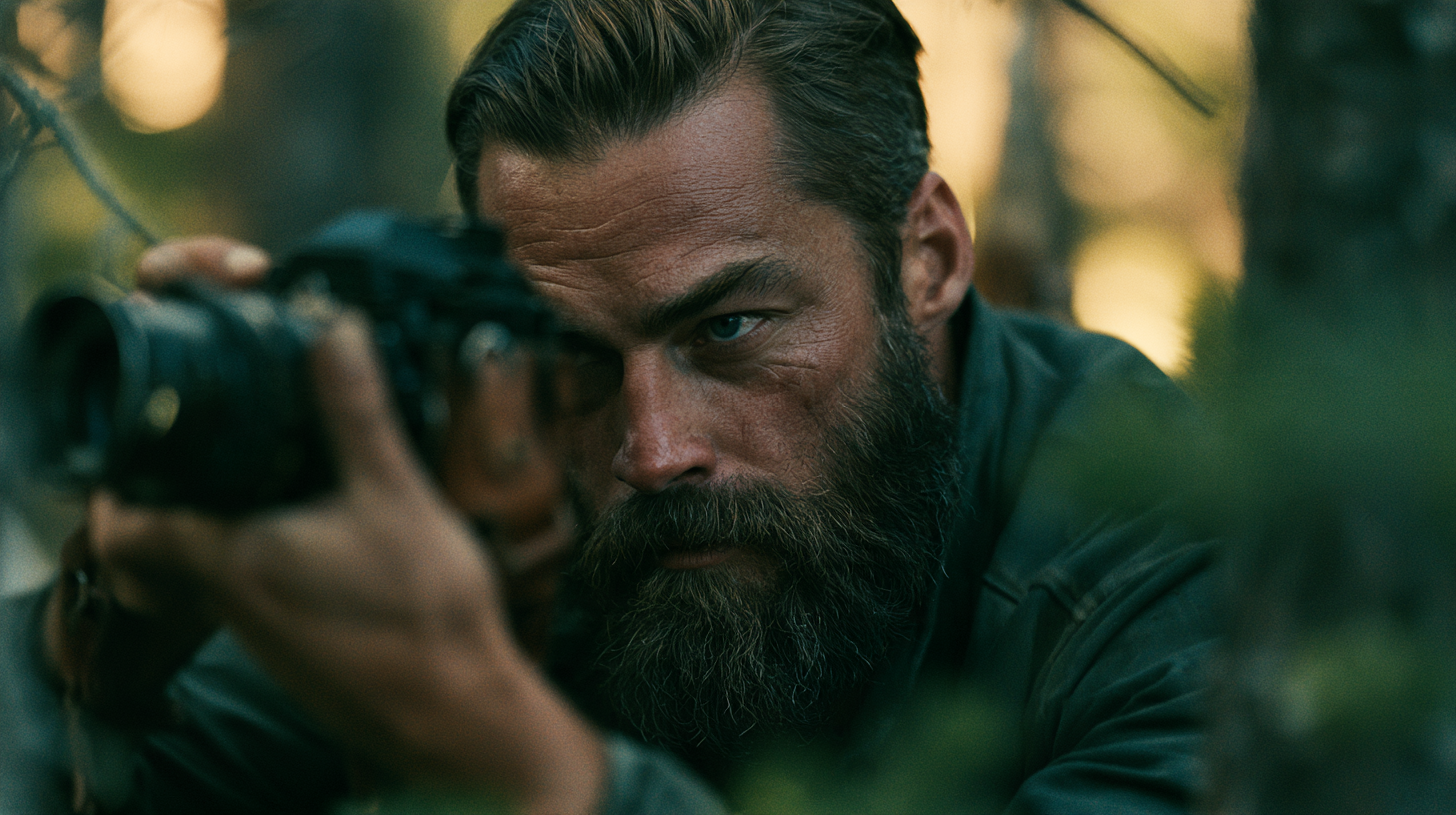
Most brand identity projects end the same way: a logo, a color palette, a typeface, and a folder of files. Brand photography gets sorted out later — usually by whoever builds the website, usually from a stock library, usually against a deadline. By the time the pages go live, the photographs are doing more visual work than every other element combined, and nobody specified them.
That ordering is backwards. Brand photography is not decoration applied to a finished identity. It is one of the largest components of the identity itself, and treating it as an afterthought is the most common reason a carefully designed brand still looks like everyone else.
The logo occupies almost none of the screen
Count the space sometimes. On a typical homepage the logo sits in a corner of the header, perhaps two percent of what a visitor actually sees. One hero image can take sixty. Scroll down and the ratio holds. Photographs set the tone of every section on the page, while the mark reappears briefly in the footer and that is the end of its day’s work.
A brand that controls the two percent and leaves the rest unmanaged is not controlling much. This is why two businesses with completely different logos can feel interchangeable online. It is also why a sharp, well-drawn mark sometimes lands in a layout that quietly undoes it. The photography formed the impression first.
Stock imagery fights the palette
A color palette is a set of relationships, not a list of hex codes. Those relationships hold as long as nothing else on the page introduces color that was never accounted for. A photograph introduces hundreds of them at once.
A brand narrowed to three disciplined colors can be flattened by a single image with a teal backdrop and a bright orange jacket in the middle of frame. Nothing in the design broke. The palette is still correct in the style guide. It simply stopped being visible, because the loudest colors on the page now belong to a photographer who had never heard of the business.
This is also why stock imagery reads as stock. The problem is rarely quality; much of it is technically excellent. The problem is that each frame was lit, graded, and composed to a different standard, so a page full of them has no single point of view.
Three decisions shape brand photography
Brand photography does not require a commissioned shoot to be consistent. It requires constraints, and three of them do most of the work.
Light. Decide on direction and quality, then hold to it. Soft overcast light and hard midday sun are not two options inside one brand; they describe two different businesses with two different temperaments. A library that mixes them has no voice.
Color. Images should live in a narrow range that agrees with the palette rather than competing with it. The Alder Files builds photography around evergreen, slate, and leather brown, and frames that fall outside that range get rejected regardless of how good they are on their own merits.
Distance. How close the camera stands to its subject is a stylistic choice, and a consistent one does more for coherence than most people expect. A set of tight, close-in frames reads as one voice. The same subjects shot from across the room read as another. A mix of both reads as neither.
None of these decisions require a budget. They require a choice made once and applied every time after that, which is the harder part.
Write the rule, not the library
Few small businesses can commission enough photography to cover every page they will ever publish, and most that try end up with a folder that runs dry inside a year. The more useful deliverable is a rule: a short, specific paragraph in the style guide describing what an image has to do to belong to the brand, with two or three example frames and a plain list of what to reject.
A rule travels. It still works when the business is shooting on a phone, when it hires a photographer who has never seen the identity, when someone picks an image for a post on a Thursday afternoon with ten minutes to spare. A library only works until the library runs out.
The Alder Files writes brand photography specifications into the same document as the color and type rules. A style guide that covers the logo in detail and says nothing about imagery has left the largest part of the brand undefined.
The test
Cover the logo on any page and look at what remains. If what is left still reads as one specific business — a particular temperature of light, a particular range of color, a particular distance from the subject — then the brand photography is carrying its share of the identity. If what is left could belong to anyone, the brand is thinner than it looks, however good the mark is.
That gap widens over time. A logo gets redrawn once every several years at most, under supervision, by someone who was hired to think about it. A photo library turns over constantly: image by image, post by post, chosen by people who were never in the room when the design work happened. The written rule is the only part of the identity that reaches those decisions at all.