
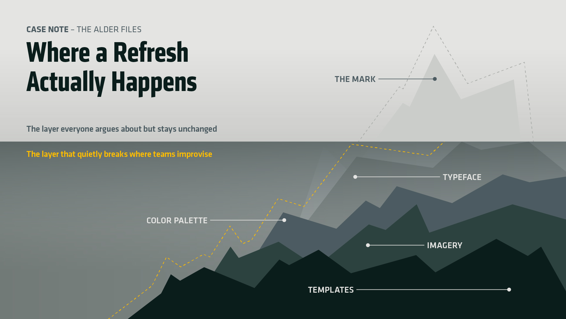
Brompton refreshed its brand identity in August. Studio Blackburn led the work. The folding-bike maker’s logo came through untouched, and so did the triptych symbol beside it. For a brand refresh that drew coverage across the design press, that is an odd thing to lead with — and it is the most useful part of the story.
What the brand refresh actually changed
The logotype was never the problem. What was missing was everything meant to sit around it. Brompton had never extended its wordmark into a full character set, so every time a team needed a headline for retail signage, a campaign, or a product page, someone picked a typeface that looked close enough. Multiply that across markets and the identity drifts. Not dramatically. Just enough that nothing quite matches.
Studio Blackburn worked with type designer Sam White to draw Brompton Slab, a headline face pulled out of the logo’s own letterforms. They also named an industrial blue as the primary visual anchor, and they set “Life Unfolded” as the phrase the messaging hangs from. The mark itself stayed exactly where it was.
The best detail sits in the photography. The team cut oversized metal letters at Brompton’s London factory and shot them on the floor where the bikes are made. In other words, the new typeface arrives already attached to the place that gives the brand its credibility, which is a harder thing to fake than a page in a style guide.
Why most brand refresh projects start in the wrong place
A logo is the part of an identity everyone can see, so it becomes the part everyone wants to discuss. It presents well in a deck. It gives a client something to react to in the first meeting. Redrawing it produces visible change quickly, which is why so much of a budget goes there before anyone examines anything else.
But it also tends to fix nothing. Inconsistency in an established brand rarely traces back to the mark. It traces to the gaps: no headline typeface, no rules for secondary color, no photography direction, no answer for the regional team that needs a banner by Friday afternoon. People do not go off-brand out of defiance. They go off-brand because the system ran out before their problem did.
That distinction drives the decision between a refresh and a rebuild. A rebuild replaces the position and the visual language together, and it belongs to brands whose meaning has genuinely changed. A brand refresh tightens what already works and finishes what someone left unfinished. Brompton’s is clearly the second kind, and it never pretends to be the first.
Restraint is the expensive decision
Leaving a mark alone takes some defending. A client paying for a brand refresh expects to see change, and “the logo stays” can read as a studio declining to do the work — right up to the first quarter where every regional team sets headlines in the same face and the company finally looks like one company again.
That is the version of restraint worth arguing for. Not minimalism as a look. Restraint as a judgment about where the money goes: into the parts of a system that fail quietly, every day, in a hundred places nobody photographs. The Alder Files works from the same premise, because knowing what to cut is the harder half of the job, and almost never the half that earns applause.
The question worth asking first
There is a practical way to find the real brief. Before touching the mark, look for where people improvise. Find the template someone rebuilt from scratch inside a slide deck. Note the colors that circulate everywhere and appear nowhere in the guidelines. Then ask which typeface the sales team keeps defaulting to because nobody ever gave them the right one.
Improvisation is diagnostic. It marks the exact point where an identity stopped giving people what they needed and left them to invent the rest. Brompton’s teams were improvising type, so the answer was a typeface. The diagnosis came first and the deliverable followed from it. Most brand refresh work runs the other way around.
So the next time a brand feels inconsistent, the question is not what the logo should become. It is where people had to make something up to get their work out the door.