
Ask a small business owner what made YETI work and the answer arrives fast. The films. The ambassadors. A marketing budget with no visible bottom. That explanation is comfortable because it puts the whole thing safely out of reach. It also skips the part worth studying, which is that the YETI brand identity is unusually quiet for a company that sells so loudly.
Nothing in the visual system is trying to win an argument. The mark is a wordmark, set bold and plain. The palette stays muted and outdoorsy. There is no illustration system, no mascot working overtime, no clever secondary device that needs a page of explanation before anyone can use it. Reduce the identity down to what it actually puts on a page and there is very little there.
That emptiness is deliberate, and it is the hardest part to copy.
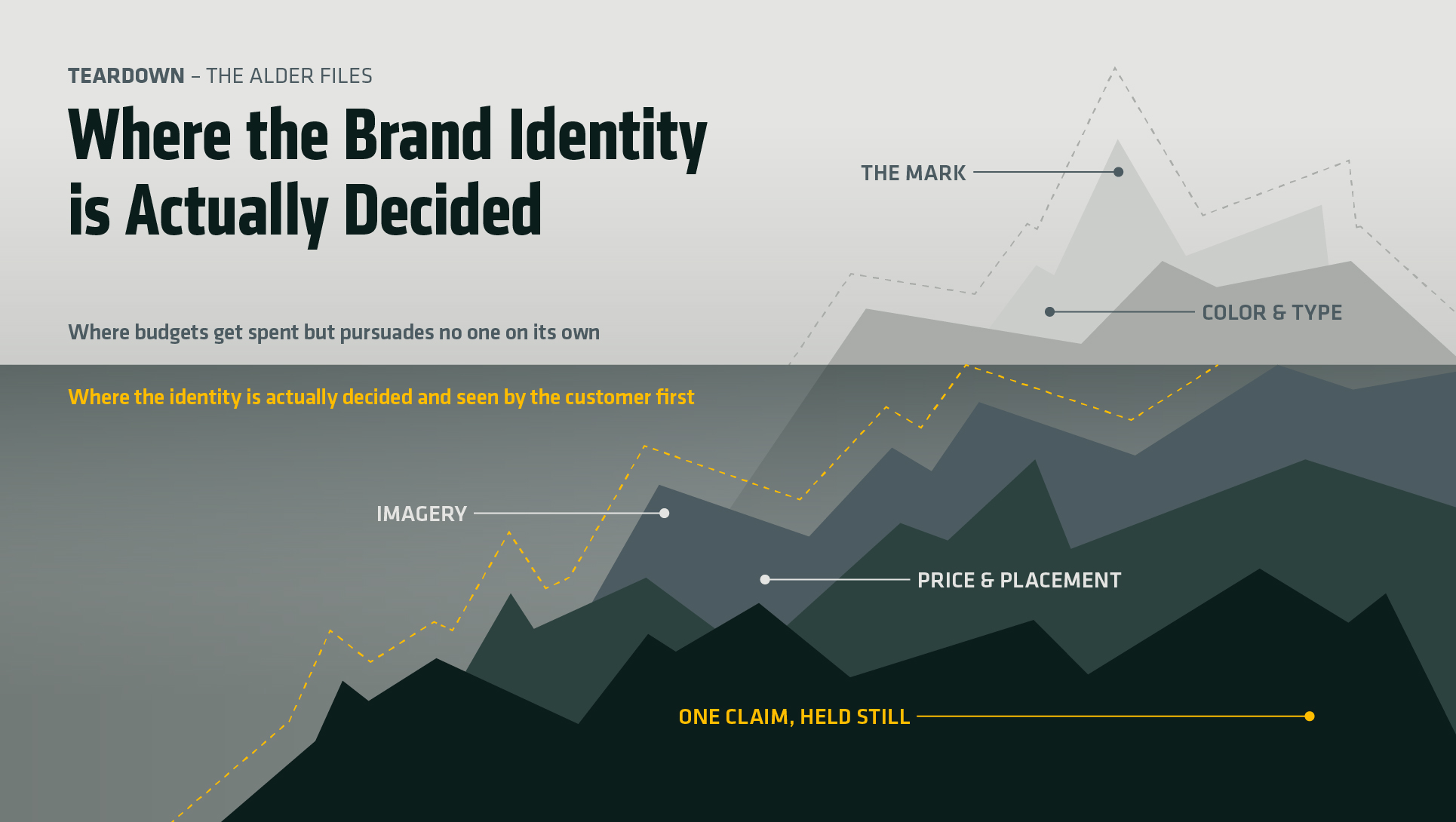
The Mark Is a Label, Not an Argument
A wordmark that plain can only do one job: confirm. It tells a person holding the product what they are holding. It never has to persuade anyone, because the persuading already happened — in the weight of the lid, in the shop where it was bought, in a film watched a month before the purchase.
Most identity projects invert this. The mark is asked to deliver the positioning, the personality and the differentiation all at once, usually because it is the only line anyone budgeted for. It cannot. No mark can. The YETI brand identity does almost nothing at this layer, and that is a choice rather than an oversight. The gap between a logo and a full brand identity is exactly where most of the money gets misspent.
One Claim, Held Still
The positioning compresses to four words: built for the wild. Product launches point back to it. Customer emails point back to it. The films point back to it, and nothing else has been allowed to sit beside it.
Writing a line like that is not the difficult part. Any competent copywriter produces one in an afternoon. The difficulty is the years spent declining to add a second claim next to it — no value tier, no seasonal repositioning, no widening of the audience the first time growth flattens. A brand line starts to feel stale inside a company long before the market has heard it once, and that internal boredom is what kills most positioning. The restraint is in refusing to act on it.
Where the YETI Brand Identity Actually Lives
The imagery is where the system does its work. Muted outdoor tones. Weather. Gear that looks used rather than styled. The people in the frame are guides, anglers and hunters, and the brand has been open about preferring a good story from a real person over a famous face.
That is a photography direction narrow enough to be enforceable. A photographer can be handed it and get it right without a phone call. Compare it to the image guidance most businesses write, which asks for authentic, aspirational, premium and approachable at the same time, and therefore asks for nothing at all. A direction that cannot be violated is not a direction.
Distribution Was an Identity Decision
The choice that gets the least credit is where the coolers were allowed to be sold. Early distribution ran through independent tackle shops and sporting goods stores rather than the national chains, and for years the majority of sales came through those small retailers. A three-hundred-dollar cooler in a category where thirty dollars was normal only reads as serious if the shelf around it is serious.
Price and placement did as much for the YETI brand identity as any design decision, and no designer touched either one. They are read faster than a logo is. They are also the two calls a business owner already controls, without hiring anyone.
What Transfers From the YETI Brand Identity
The expensive parts transfer to nobody. The films do not. The ambassador roster does not. Two decades of product engineering do not.
Stripped of the budget, what is left reduces to a short list of refusals, and refusals are free. One claim the product can genuinely keep. A photography direction narrow enough that a stranger could shoot to it. A decision about where the thing is allowed to be sold, made deliberately rather than by whoever says yes first. Written down, that is five lines. Most brand guidelines run forty pages and contain none of it.
The Part Nobody Wants to Hear
The uncomfortable finding in this teardown is the order of events. The restraint did not show up once there was something worth protecting. It was there when there was nothing, at the point where adding a cheaper line or a second story would have been the obvious way to survive the quarter.
Most businesses plan to get disciplined after they scale. The sequence runs the other way. The ones that wait usually find there is nothing distinct left to be disciplined about, because every decision that could have set them apart was already traded away for a quarter of revenue.
The Alder Files starts brand identity work with the refusals: what a business will not claim, will not photograph, and will not sit on a shelf beside. Everything designed after that is smaller, and it lasts.