
Most outdoor brands land on the same palette. Muted green, dusty orange, a gray that photographs well against granite. Topo Designs has run close to two decades on saturated red and blue instead, which makes the Topo Designs brand identity an easy thing to explain badly. The color is the brand, the explanation goes.
That explanation gets the visible part right and the working part wrong.
Read the identity as a system rather than a look, and what holds it together is a set of constraints narrow enough to be uncomfortable. That narrowness is the part worth taking.
Color Is a Rule, Not a Mood
Founder Jedd Rose has described red as the color he values most, for what it communicates: intensity, urgency, timelessness. The brand’s blue was chosen deliberately against the blue the outdoor category reaches for. Taken alone, that reads as preference. It isn’t. The studio describes its palette as a hybrid: bright, outdoorsy color set against darker, classic hues, with individual colors chosen for saturation and for how they behave beside each other rather than how they look in isolation.
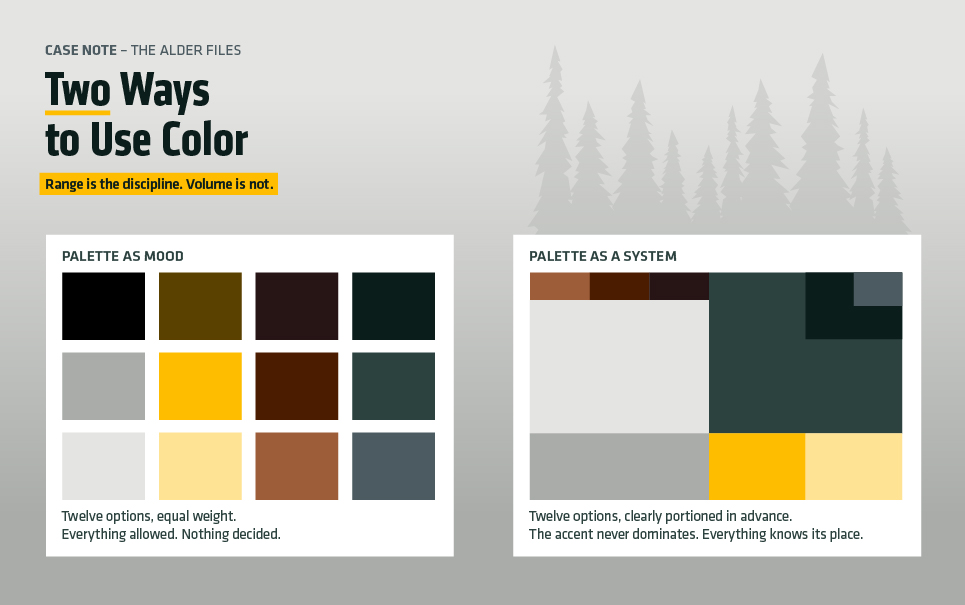
That last part is the rule. Bright color in this system almost never appears alone. It sits against something dark: black, olive, natural canvas. The boundary is what keeps a red pack from reading as a novelty item. Strip the dark field out and the same red goes loud in the way a traffic cone is loud.
Restraint here is not low volume. It is narrow range. A brand can be bright and still be disciplined, provided it has decided in advance what the bright color is not allowed to do.
A Small Vocabulary of Shapes
The mark reads as a folded map: angular planes meeting along a ridge, flat, with no rendering or depth to lose at small sizes. It does the same job embroidered on a patch, screened on a tag, or stamped into hardware. That is not an accident of taste. It is what happens when a mark is drawn for the places it will actually have to live.
The Topo Designs brand identity repeats that geometry elsewhere in the product — in panel seams, in the line where a contrasting base meets the body of a pack, in the cut of a pocket. One shape family, repeated at different scales, across materials that behave nothing alike. That repetition is what makes a design system a system. Most small brands never get there, because they keep adding forms instead of repeating one.
The Topo Designs Brand Identity Does Not Sit in the Logo
Cover the mark on one of the packs and it stays identifiable from across a train platform. The color blocking carries it. That property is rare and badly undervalued, because a logo is almost always the element least able to do recognition work. It ends up small, low-contrast, partly obscured, or facing the wrong way.
Most small brands load everything onto the logo and then wonder why recognition never compounds. The identity here gives recognition a second carrier, in an element that is large, unavoidable, and legible at distance. The logo confirms. The color blocking announces. That division of labor is the same one running underneath the YETI identity, arrived at from the opposite direction.
A Designer’s Fingerprints
This gets less surprising once the background is clear. Rose studied sculpture and printmaking, then spent more than a decade in graphic design and branding roles before the first bags were sewn in a Fort Collins basement in 2008. Co-founder Mark Hansen came in from field biology, teaching, and software design.
The result behaves like a system made by someone who has had to hand a brand over to other people. Sewers, factories, retail partners, photographers. Rules that survive that handoff are short, specific, and dull to read. Rules that don’t survive it are usually the ones written to sound good in a presentation.
What Transfers
None of what makes the Topo Designs brand identity work requires a bag company or a Denver address.
Pick the colors and defend them. Two is enough. The point is not which two, but that the answer stops changing every quarter.
Write the boundary down. State what the accent color is never allowed to do: no full backgrounds, no body copy, no more than a fixed share of any surface. A palette without a rule attached is a mood board.
Give recognition a second carrier. A shape, a crop, a material, a proportion. Something that still works when the logo is nine pixels tall or missing from the frame entirely.
The Cover Test
There is a fast way to find out which kind of identity a brand has. Cover the mark on a product shot, a storefront, an invoice, an ad. Then ask someone who has seen the brand twice whether they can name it.
Most fail that test. Failing it is not a crisis, and it rarely calls for a redesign — Brompton spent its refresh budget on what surrounded the logo, not the logo. It usually means the identity is one element deep. The fix is to choose one more element and then hold it still long enough for anyone to notice.
Sources: Topo Designs on its signature colors; Topo Designs company background.