
Signature Benefits
The Inspiration
Signature Benefits started as Gann Insurance Solutions, named after the two brothers who founded it, before the partners decided the business needed a name with more room to grow — something that welcomed clients in rather than centering the founders. “Signature” was the deliberate answer: a word that already carries connotations of maturity, trust, and individuality, since no two signatures are ever quite the same, the same way no two clients’ benefits needs really are. That idea became the whole thesis for the brand — an independent brokerage that isn’t tied to any single insurance carrier, working directly for the client instead of pushing whatever a commission structure favors. With a name that strong already locked in, the job became building a visual identity that felt just as considered: upscale enough to compete with larger, more established firms, personal enough to still feel like two brothers who left bigger companies specifically to work closer with their clients, and precise enough to reflect a brand whose entire premise is treating every client’s plan as genuinely their own.

The Logo
A name this personal called for a mark that felt handwritten rather than manufactured, so the wordmark leans on a flowing script for “Signature” — the closest thing a logo can get to an actual signature — paired with a small, disciplined sans-serif set of “BENEFITS” underneath to keep the whole thing legible and grounded. That contrast between loose and structured runs through the entire mark: on its own, a script logo risks reading as overly soft for a brokerage that also needs to be taken seriously by underwriters and HR directors. The supporting monogram solves that problem for smaller applications. A gold-framed square holds an interlocking S and B, built from continuous overlapping line work rather than two separate letterforms bolted together, so the mark reads as one connected shape instead of a stitched-together acronym. It compresses the full identity down into something that survives a favicon or a social avatar without losing its character, while the full script lockup stays reserved for the moments — a letterhead, a booth banner — where there’s room to let it breathe.
The Color Palette
Insurance and finance both lean heavily on the same visual shorthand — navy, gold, a lot of restrained confidence — and Signature Benefits didn’t need to fight that convention so much as execute it with more precision than most. Indigo, a deep navy-black, carries the weight of the brand and signals the stability clients want from anyone managing their benefits. Metallic gold plays against it as the accent that signals a step above standard brokerage work, used sparingly enough to still feel earned rather than decorative. Glaucous, a soft slate blue, and alabaster, a warm off-white, round out the palette as neutral ground for the colors that do the heavy lifting to sit against, keeping pages from tipping into either stark corporate black-and-white or an overly heavy navy wall. It’s a conservative palette by design, built for an industry where clients are trusting a company with something as serious as their employees’ healthcare.
The Typography
The script in the logo does the emotional work of the brand, which meant the supporting typeface needed to stay completely out of its way. Stolzl handles that job — a clean geometric sans with a full range of weights, from a barely-there thin up through a confident bold, built to cover everything the script logo can’t: body copy, data-heavy proposal documents, small print on a business card. Nothing about Stolzl is trying to have its own personality; it’s chosen specifically because it recedes, letting the script wordmark stay the one distinctive voice in the system rather than competing with a second flashy typeface. That kind of restraint matters more in insurance and benefits materials than almost anywhere else — clients reading a coverage summary or a rate comparison need clarity first, and a quiet, well-weighted sans is what actually earns their trust page after page.
The Design Elements
Small, interlocking square outlines show up as a recurring corner ornament across the brand, a quieter echo of the same overlapping geometry built into the S and B monogram. They act mostly as a signature of their own — a way of marking a page or a booth panel as unmistakably Signature Benefits without needing the full logo present every time. Photography carries a different job entirely: showing genuine, unscripted-feeling conversations between real people rather than the stiff, staged handshake photography that so much of the insurance industry defaults to. Warm lighting, real laughter, and over-the-shoulder framing were chosen deliberately, because the actual product being sold is trust in a relationship, not a policy document, and the imagery needed to reflect that a client sitting down with Signature Benefits is having an honest conversation, not a sales pitch. Between the geometric ornament system and the photography direction, the brand splits its personality cleanly: the structure stays precise and considered, while the imagery stays warm and human, which mirrors exactly what an independent brokerage is trying to prove it can be.
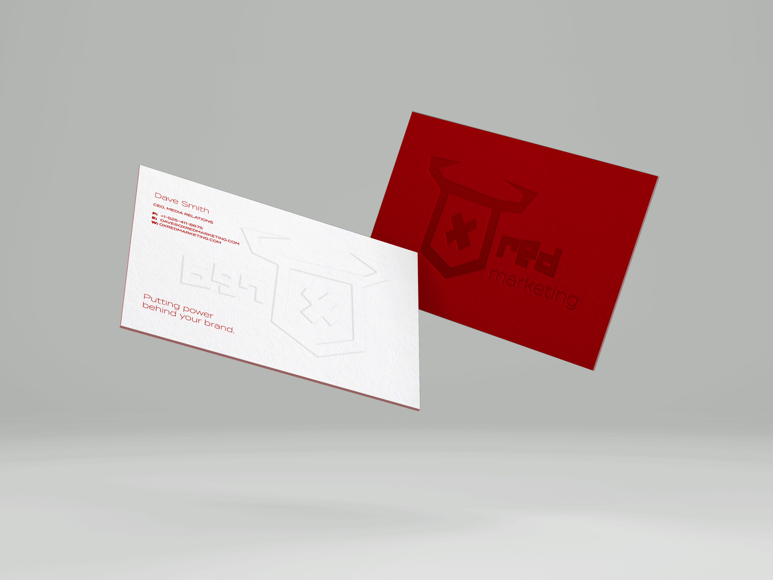
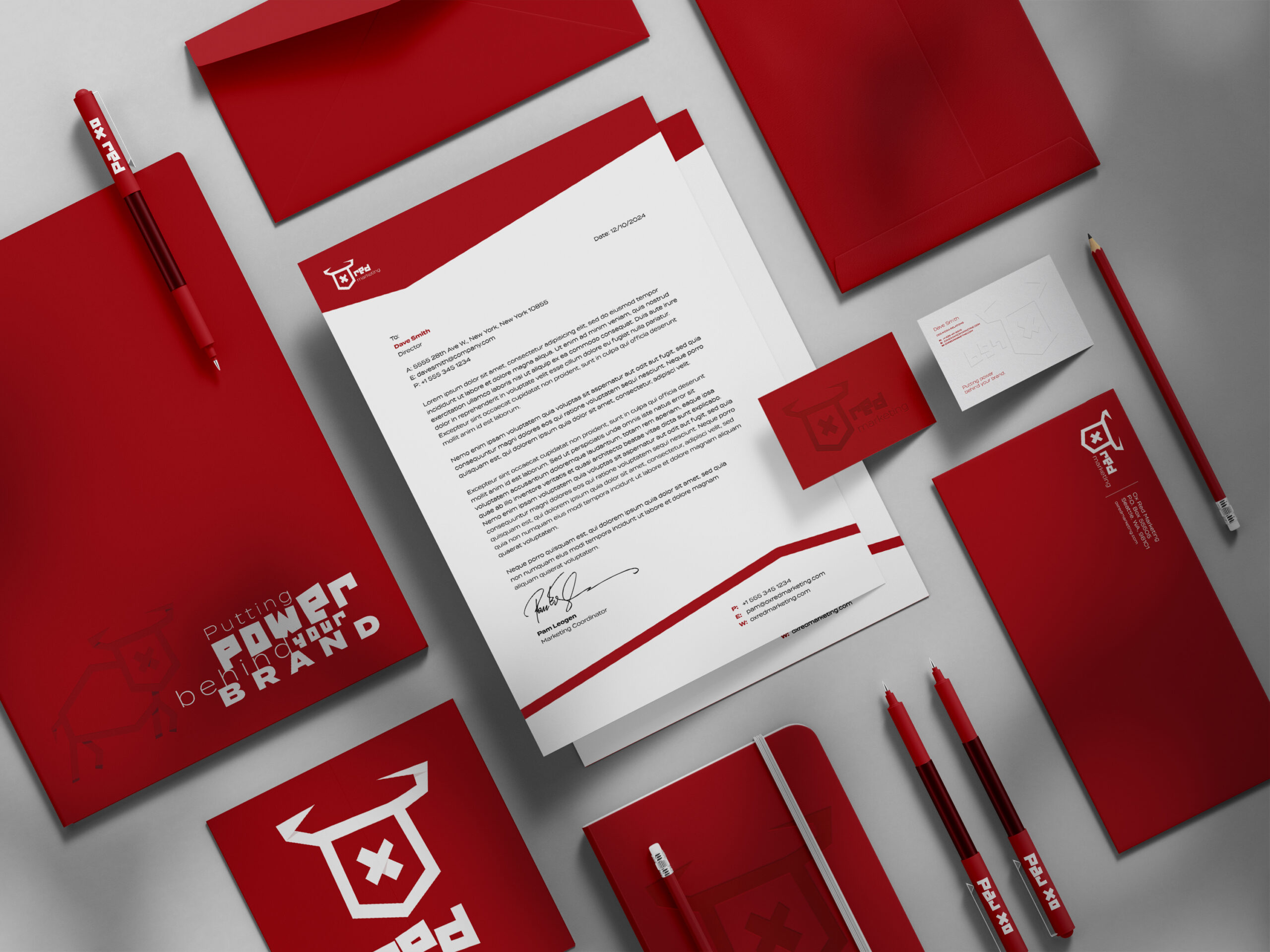
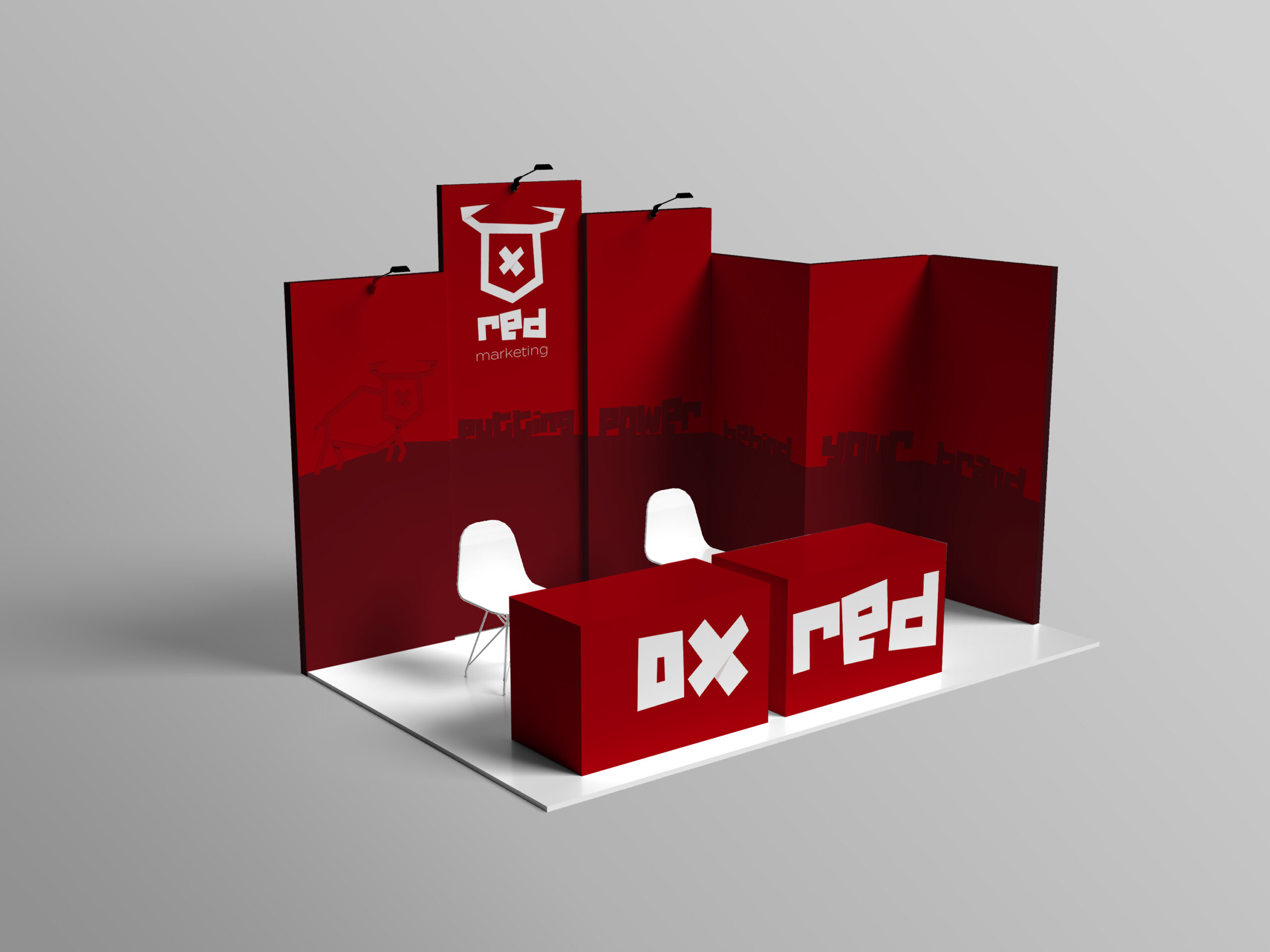

The Examples
An insurance brokerage lives or dies on trust built face to face, which meant the identity had to prove itself in the rooms where that trust actually gets built: a trade show booth, a stack of business cards handed across a table, a letter signed and mailed to a new client. What follows is that system doing exactly that — a full stationery suite carrying the same navy, gold, and geometric ornament from the smallest business card up to a complete booth build, with messaging built to answer the question a small business owner is actually asking: better coverage, better rates, and a single point of contact who actually works for them instead of an insurance carrier. It’s a brand meant to be handed to someone directly, not just scrolled past, which is exactly the kind of relationship Signature Benefits was built around.
Ready to Start Your Own Project?
Every project starts the same way — a brand that needs to work in the real world, not just look good in a pitch deck.
If that's where you are, let's build a brand identity that holds up.