
Pro Connect Group
The Inspiration
A brochure is usually the easiest brief in the world to underdeliver on — safe colors, a company logo, some bullet points about services. PCG’s first ask looked exactly like that on paper. But the actual work they do isn’t safe or quiet: it’s live audio and lighting production, the kind of work where a show either runs flawlessly under real-time pressure or it doesn’t run at all. That gap between what the existing brand looked like and what the company actually felt like in the room was the real opening. Rather than deliver a competent brochure inside a forgettable brand, the brief became an audition: build one piece with enough color, motion, and energy to show PCG what their own identity could feel like if it actually matched their work. It landed. What was meant to be a single deliverable turned into the starting point for a full identity system, because a client that produces unforgettable live shows deserved a brand that was just as hard to forget.

The Logo
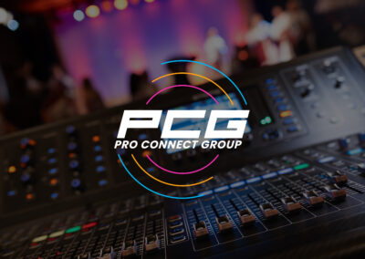
The PCG wordmark itself wasn’t the problem — the bold, forward-leaning cut of the letters already had presence. What it lacked was anything to frame it, any system that turned a logo into an identity. The fix was building outward from the mark’s own geometry: the wordmark’s forward lean set the angle for everything else in the brand, and a set of concentric arcs, borrowed from the shape of sound radiating outward, now curve around the logo like the mark is actively broadcasting. That same idea compresses down into a circular badge version built specifically for the tight, square-cropped world of social media and app icons, where a full horizontal lockup would lose all its detail. Two color treatments — solid black for light backgrounds, solid white for dark — keep the mark legible everywhere from a printed letterhead to a stage banner. None of it changed what PCG’s name looked like. It gave that name somewhere to live.
The Color Palette
Darkness came first. PCG’s world is a venue before a show starts — dim, quiet, full of potential — and the palette starts from that same blank stage: a near-black foundation deep enough to feel like a room with the house lights down. Color only shows up deliberately after that, the same way stage lighting does: fresh sky blue for the calm, technical precision running behind every event; electric pink as the pulse of the room at its peak, the color of a crowd leaning in; and amber glow for the creative spark and momentum that make a live show feel alive rather than mechanical. None of the three colors get blended into each other or allowed to crowd the same space — they cut through the dark one at a time, with intention, the way real stage lights hit a crowd. A quiet backdrop making room for a few precise, vivid moments is the whole point.
The Typography
PCG’s type system leans on Poppins, a clean geometric sans that was never meant to be the flashy part of this identity — that job belongs to the color and the arcs. What Poppins brings instead is range: regular weight for body copy that needs to stay readable across a brochure or a proposal, semibold and extrabold for headlines and callouts that need to hit hard on a banner or a slide, and a full italic set throughout that echoes the same forward lean as the logo itself. That built-in slant is what ties the typography back to the mark without needing a custom typeface at all — every headline set in italic Poppins picks up a little of the same momentum the logo already has. It’s a practical choice dressed up to feel intentional, which is exactly the kind of discipline a brand meant to run across dozens of formats actually needs.
The Design Elements
Every angle in this identity traces back to one number: 75 degrees, the exact lean of the PCG wordmark itself. Rotate that angle 90 degrees and it produces its counterpart, 15 degrees, and together those two measurements govern every slanted line, badge, and callout shape across the brand rather than leaving designers to eyeball a diagonal that feels roughly right. That kind of precision matters more than it might seem for a brand built on live production, where the actual job is making hundreds of small technical decisions land perfectly under pressure. The second recurring shape is the circle, expressed as arcs and rings that echo sound waves rippling outward from a source. Used tightly, a single arc can frame a photo or lead the eye toward a headline; used loosely, expanding rings suggest amplification and reach. Between the fixed angle system and the flexible circular motif, the brand has a structure precise enough to feel engineered and a shape language loose enough to still feel like a live show — energetic, in motion, never quite standing still.
The Examples
The real test for a brand this colorful is what happens when it gets applied to the unglamorous stuff — letterhead, business cards, a branded ball cap, a pull-up banner for a trade show floor. Dark backgrounds and disciplined color use make that transition easy: the palette was built from the start to sit behind text and hold up in print, not just look good in a mockup. What follows is the system doing exactly that across a full stationery suite, event signage, and merchandise, all carrying the same angle, arcs, and color logic no matter the format. It’s the same brand whether it’s stitched onto a hat or lighting up a pull-up banner announcing a show — proof that a genuine identity, once it exists, doesn’t need to be reinvented every time it shows up somewhere new.


Ready to Start Your Own Project?
Every project starts the same way — a brand that needs to work in the real world, not just look good in a pitch deck.
If that's where you are, let's build a brand identity that holds up.