
Alderwood Piano
The Inspiration
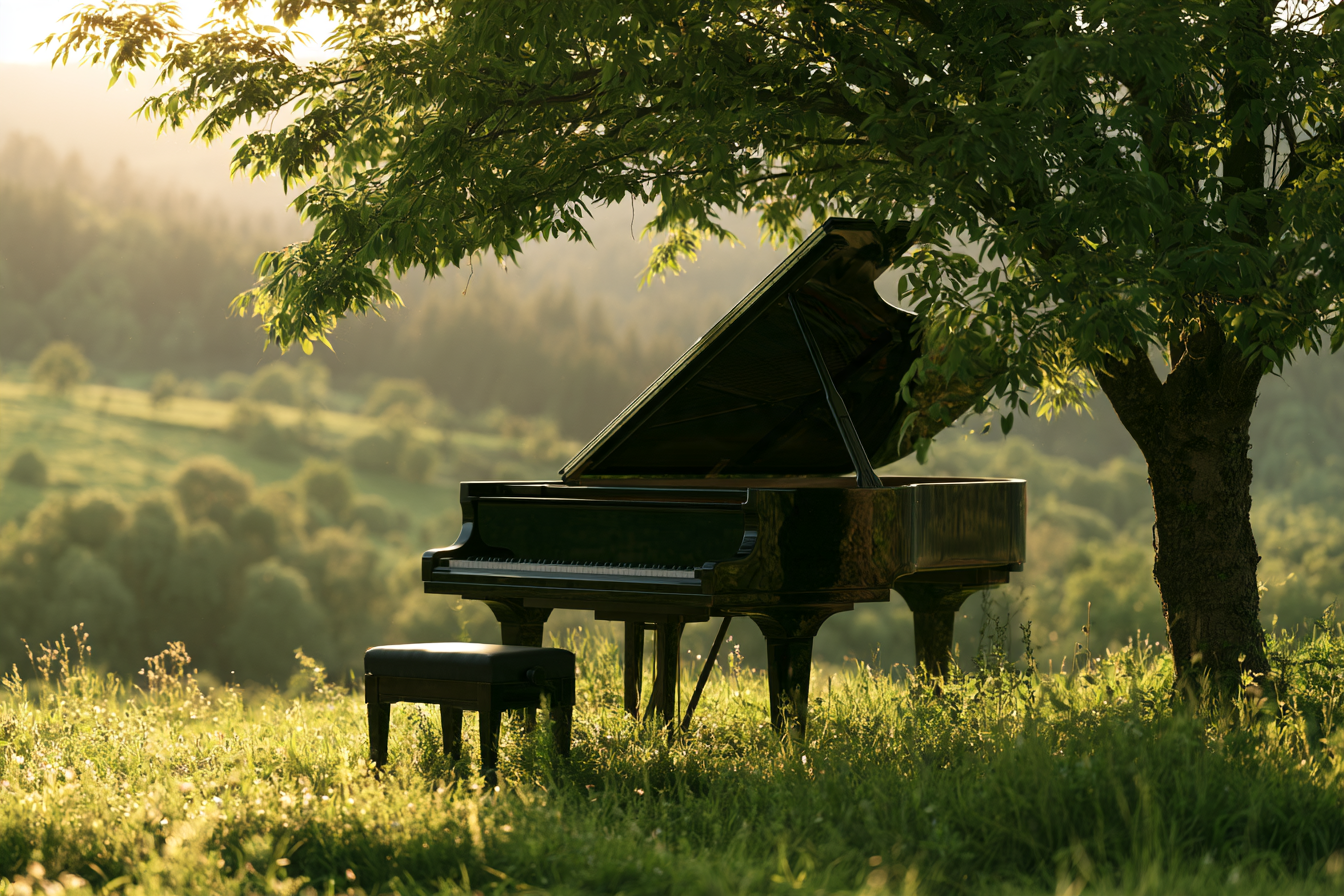
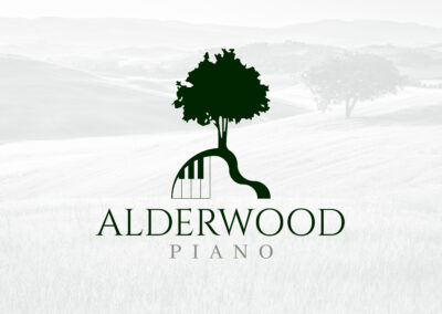
Most piano logos default to the same handful of ideas — a treble clef, a stack of black and white keys, maybe a silhouette of an upright piano. None of that says anything specific about Vera or the way she actually teaches. What she teaches on, every week, is a medium grand piano with a shape unlike any other instrument: that long, sweeping curve along the case, the one every student sits in front of during their lesson whether they’re five years old or fifty. That curve became the starting point for the whole mark, rather than a generic piano silhouette or a music-theory symbol borrowed from a hundred other studios. Pairing it with an alder tree tied the mark directly back to the studio’s own name, and folding a set of piano keys into the base of the trunk gave the whole thing a place to live — something that reads as unmistakably musical the moment the keys come into view, without needing a treble clef anywhere in sight.
The Logo
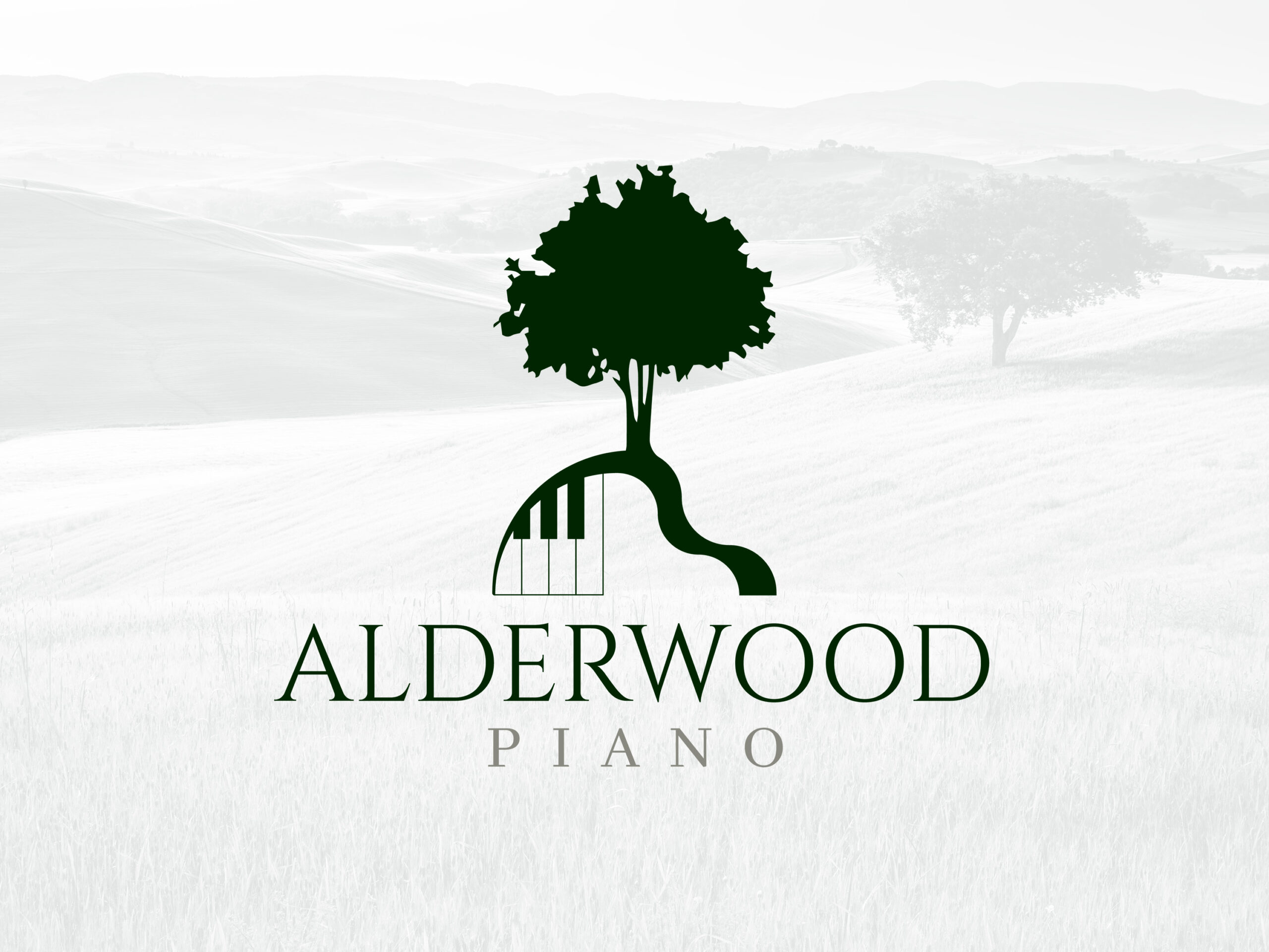
The mark works because two very different shapes turn out to share the same line: the graceful curve of a grand piano’s case and the natural bend of a tree trunk rising out of the ground. The alder tree sits on top, full and rounded in silhouette, its trunk narrowing and curving outward exactly the way a piano’s bass-side bout does — so the transition from tree to instrument happens in a single continuous line rather than two shapes stitched together. Right where that curve meets the ground, a short run of piano keys appears, tucked into the base like roots, confirming what the shape is before a viewer has to guess. The whole mark comes in two lockups: a stacked version with the tree sitting above the wordmark, and a horizontal version with the tree beside it, so the identity can adapt to a narrow business card or a wide website header without ever needing to redraw the mark itself. Simple, specific, and built around one real detail from Vera’s own studio rather than a generic music-industry symbol.
The Color Palette
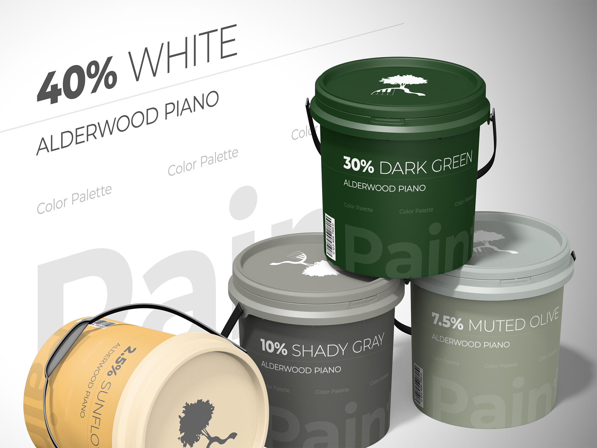
The palette leans organic on purpose, since the whole studio name is built around wood and the natural bend of a tree. A deep, near-black green carries most of the identity and does double duty as a stand-in for the piano’s own black keys — tying the color choice directly back to the instrument rather than picking a green just because it sounds nice next to “wood.” White does the heavy lifting everywhere else, keeping the mark and the site feeling open and uncluttered rather than heavy or dark. A small dash of warm yellow shows up only as an accent, never as a dominant color, giving the palette a single warm note against all that deep green and white without ever competing with it. It’s an intentionally small palette — three colors, used with restraint — built for a solo piano teacher’s studio rather than a brand trying to fill out a full corporate system.

The Typography
The wordmark keeps things quiet on purpose, since the tree-and-keys mark above it is already doing the work of catching someone’s eye. “ALDERWOOD” is set in a classic serif, spaced out and confident, the kind of lettering that reads as established and trustworthy rather than trendy — fitting for a teacher whose actual credentials include membership in the Music Teachers National Association. “Piano” sits underneath in the same serif family but noticeably lighter and smaller, functioning almost like a subtitle rather than a second headline. That size and weight difference matters: a first-time visitor should read “Alderwood” first, as the name of an actual place with an actual teacher, and only then register that it’s a piano studio specifically, rather than the two words competing for attention at equal volume.
The Design Elements
This wasn’t a project built to fill out a six-piece brand guide — Vera needed a logo and a website, and that’s exactly what got built, without inventing extra deliverables nobody asked for. What discipline exists lives in the mark itself: a single continuous line running from the tree’s branches through the trunk into the piano’s curve, plus two lockups — stacked for square spaces, horizontal for wide ones — flexible enough to run across a website header, a business card, and printed studio materials. The other real decision was photography: no stock shots of an anonymous piano or a generic smiling child at a keyboard, only Vera’s own studio, her actual piano with that same signature curve, real students at their lessons, and Vera herself teaching rather than posing. That choice matters more for a local piano studio than almost any other business, since a parent choosing a piano teacher is choosing a person to spend an hour a week with their child, not a service to purchase sight unseen — and photography carrying that same specificity is what turns the identity into something a parent can trust before ever meeting Vera in person.


The Examples
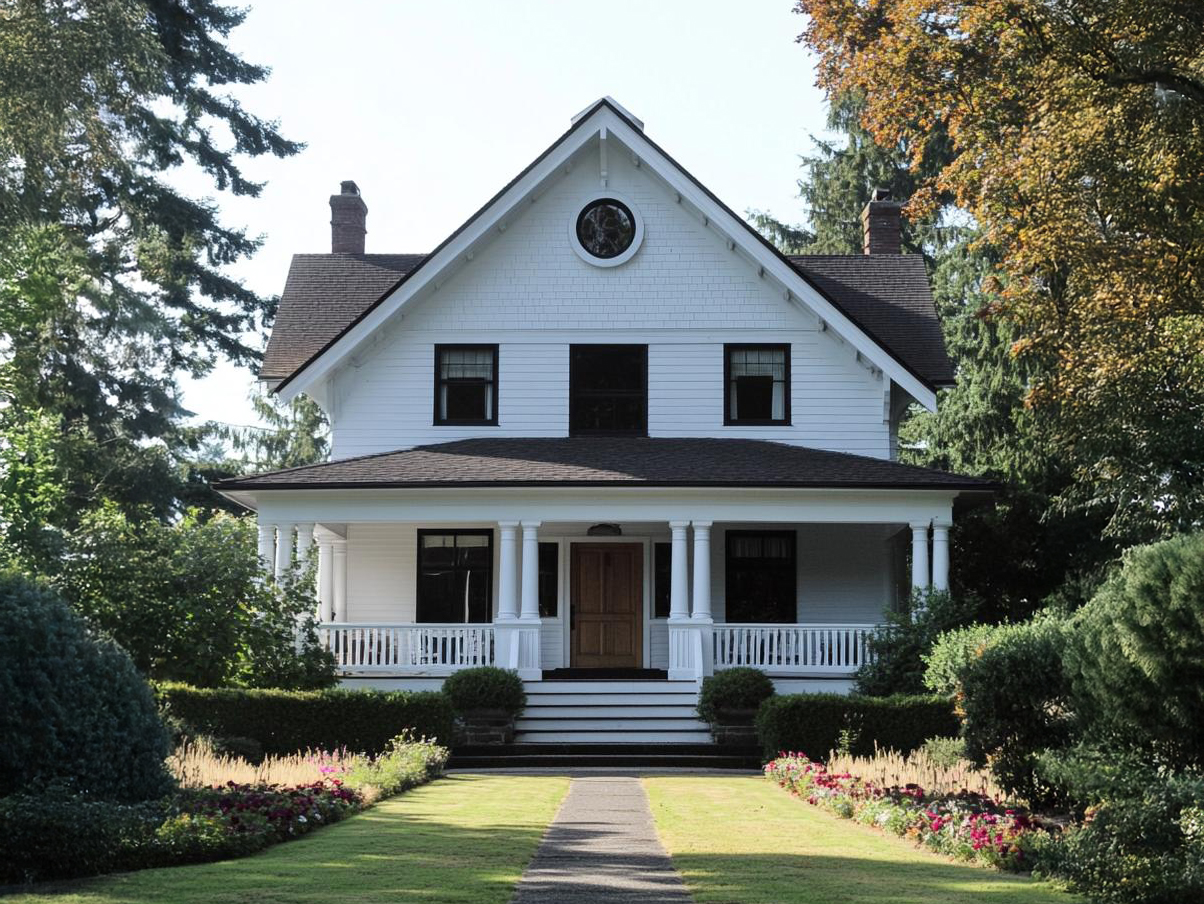
The main job for this identity was always the website — the place where a parent searching for piano lessons in Lindon actually decides whether to reach out. What follows is that mark doing its job in context: sitting at the top of the site, introducing Vera and her studio, and carrying the same warm, organic feeling through to the testimonials from real students and parents about a teacher who’s patient, encouraging, and genuinely good with kids and adults alike. It’s a smaller-scale identity than some of the other work here, built for a single teacher rather than a company with a marketing department, and that’s exactly the point: a parent looking for lessons doesn’t need a corporate brand system, they need to feel, in the first five seconds on the page, like they’ve found someone trustworthy to teach their kid.




Ready to Start Your Own Project?
Every project starts the same way — a brand that needs to work in the real world, not just look good in a pitch deck.
If that's where you are, let's build a brand identity that holds up.