
Ox Red Marketing
The Inspiration
The name came before the visuals did — which is rare. An anagram of the founding partners’ last names produced “Ox,” and once that word was on the table, the direction picked itself. An ox is unhurried, immovable, built for weight-bearing work — exactly the reputation a company producing large-scale event marketing needs before a single contract is signed. Pairing it with red wasn’t really a style choice so much as an inevitability: no color in the spectrum commands a room the way red does. Early exploration leaned hard into that instinct, testing how far “bold” could go before it tipped into aggressive. The real challenge wasn’t finding confidence — it was finding confidence that still felt approachable, since event marketing lives and dies on relationships, not intimidation. That balance became the throughline for everything that followed: a mark, a palette, and a voice strong enough to lead the room without losing the warmth that makes clients want to come back.

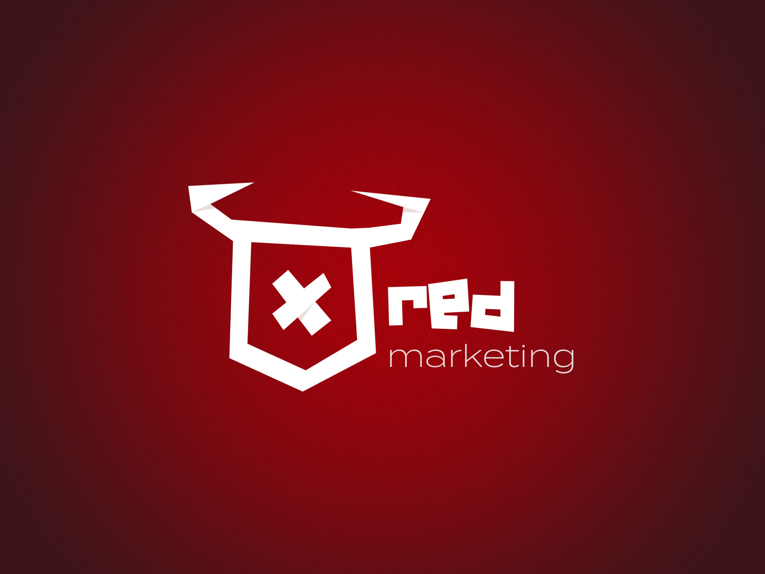
The Logo
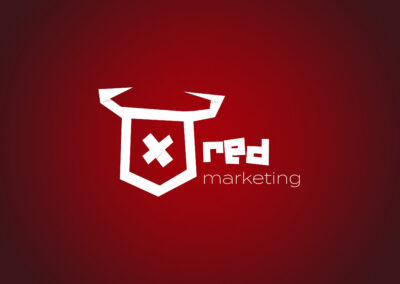
Turning “ox” into a mark meant ruling out almost every obvious path first. A literal, illustrated bull read too much like a sports franchise. Anything sharp and angular started looking like it belonged on a Wall Street letterhead, not an event marketing brand built on personality. A full, literal origami piece would have carried too much cultural weight of its own, but the folding technique itself was too good to abandon entirely — so the ox became something closer to origami’s logic than its literal form: flat planes, sharp creases, an angular head built from folds rather than curves, with a bold X marking its center like a brand stamped into the paper. Paired with a rugged, hand-cut wordmark, the mark reads as engineered and handmade at the same time — precise enough to survive a business card, rough enough to never feel corporate.
The Color Palette
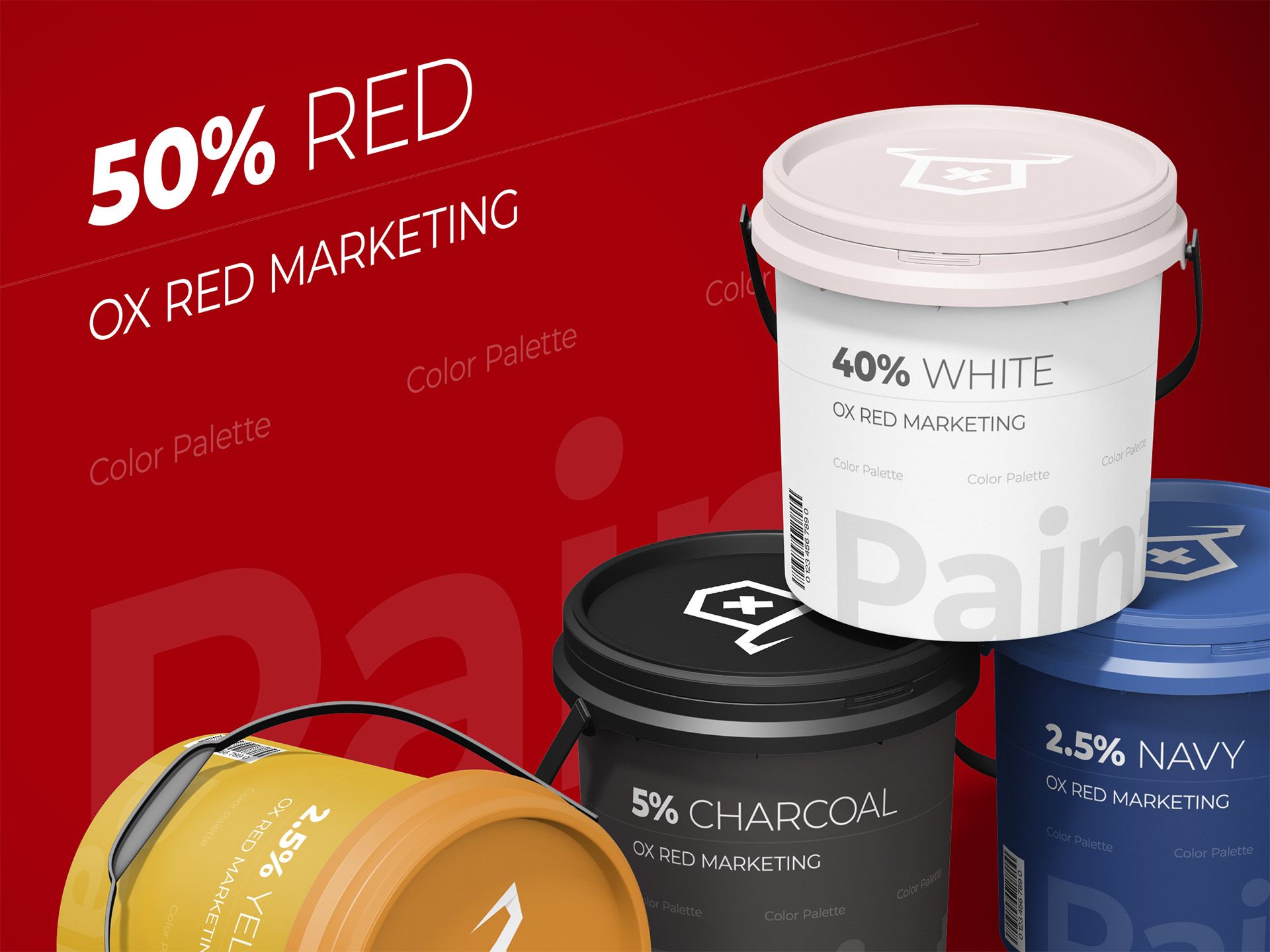
Red carries the identity, and that was the point from day one — it’s the one color that reads as decisive from across a crowded expo floor. But a palette built entirely on red risks tipping from bold into overwhelming, so it needed real ballast. White does most of that work, giving the red room to breathe and keeping the system legible instead of loud. Gold steps in as the accent that signals a level above standard — the difference between confident and merely aggressive — while a deep navy grounds the palette in something more stable underneath all that boldness. Red demands attention, white gives it space, gold adds polish, navy keeps it credible. That’s a lot to ask of four colors, but it’s exactly what a brand competing for attention in event marketing needs from its palette.
The Typography
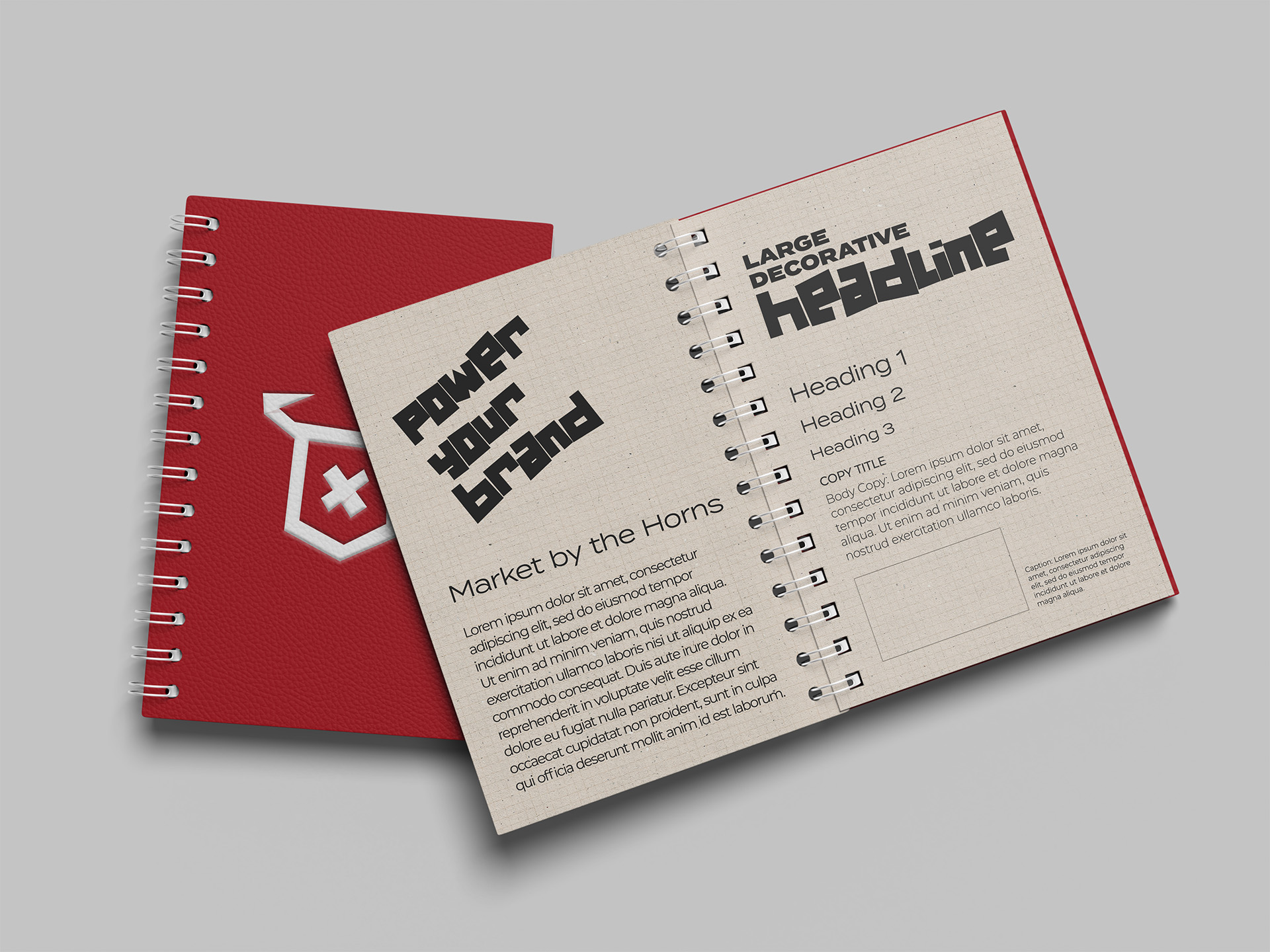
Type had to do two jobs that don’t usually get along: hit hard on a headline and stay completely legible in the fine print of a contract or a run-of-show. Montserrat carries the big moments — headlines, section titles, anything meant to be read from a distance or scanned in half a second. It’s a geometric sans with enough weight to hold its own against that bold red without disappearing into it. Open Sans handles everything else: body copy, the details clients actually need to read closely, chosen specifically so it wouldn’t compete with Montserrat for attention. The pairing mirrors the same balancing act running through the rest of the identity — one typeface built to make an entrance, the other built to make sure the substance behind it actually gets read.
The Design Elements
Individually, a bold red palette, a weighted display font, and a confident wordmark are strong choices. Together, they need rules — otherwise “bold” collapses into “chaotic” the moment the brand shows up somewhere unplanned, like a sponsor banner or a last-minute signage request three days before doors open. The system leans on a small set of repeatable moves: the wordmark anchored consistently, red used with intention rather than everywhere at once, and enough white space to let each element land instead of competing for the same eye. Supporting shapes and dividers borrow the same weight and angularity as the logotype itself, so even a stray graphic element still reads as unmistakably theirs. It’s built less for a single polished brand guide and more for the reality of event marketing, where materials get produced fast, under pressure, by more than one hand, and still need to look like they came from the same place.
The Examples
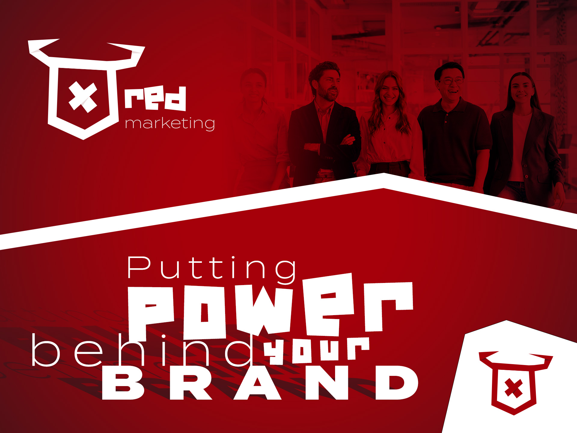
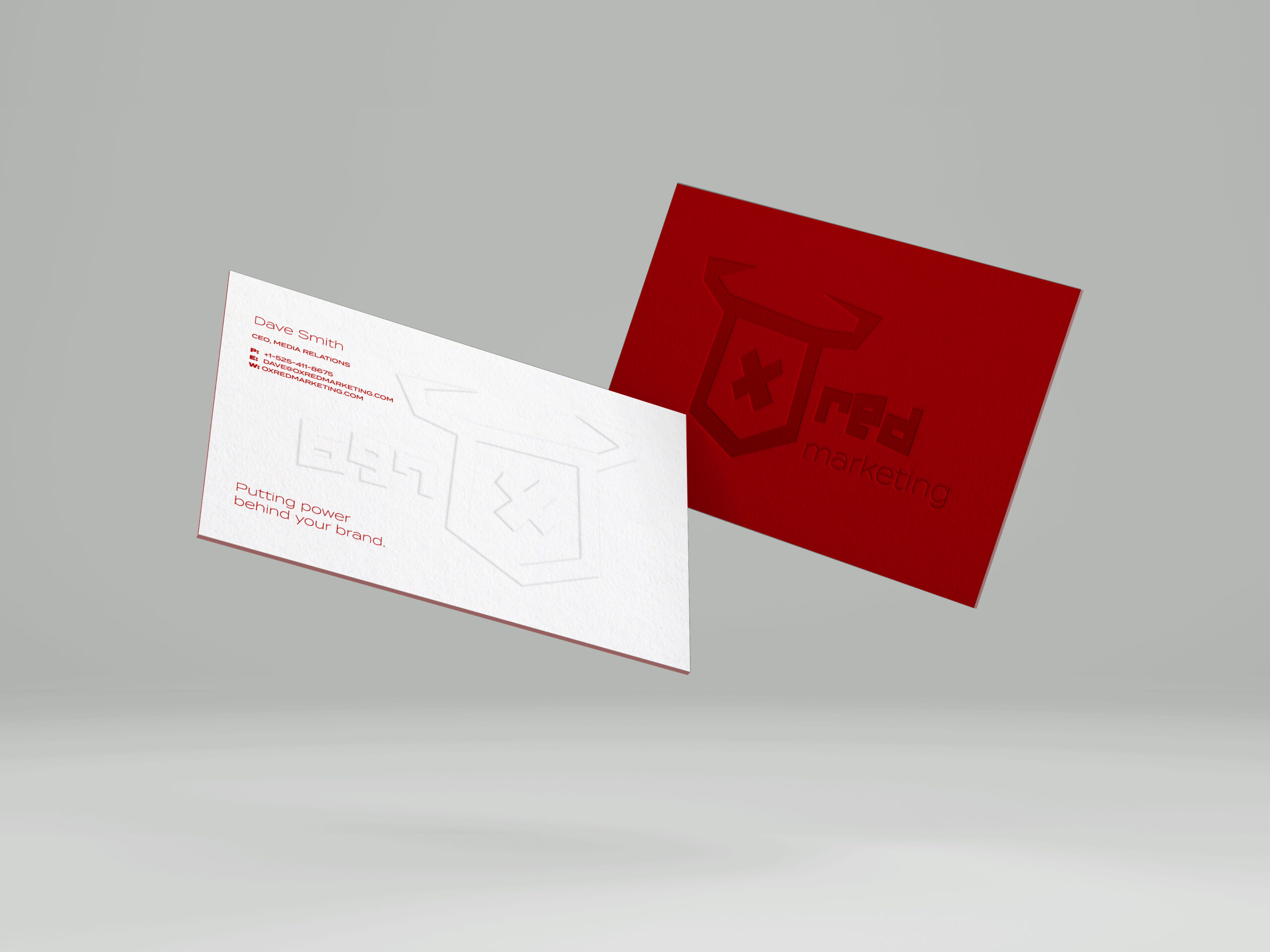
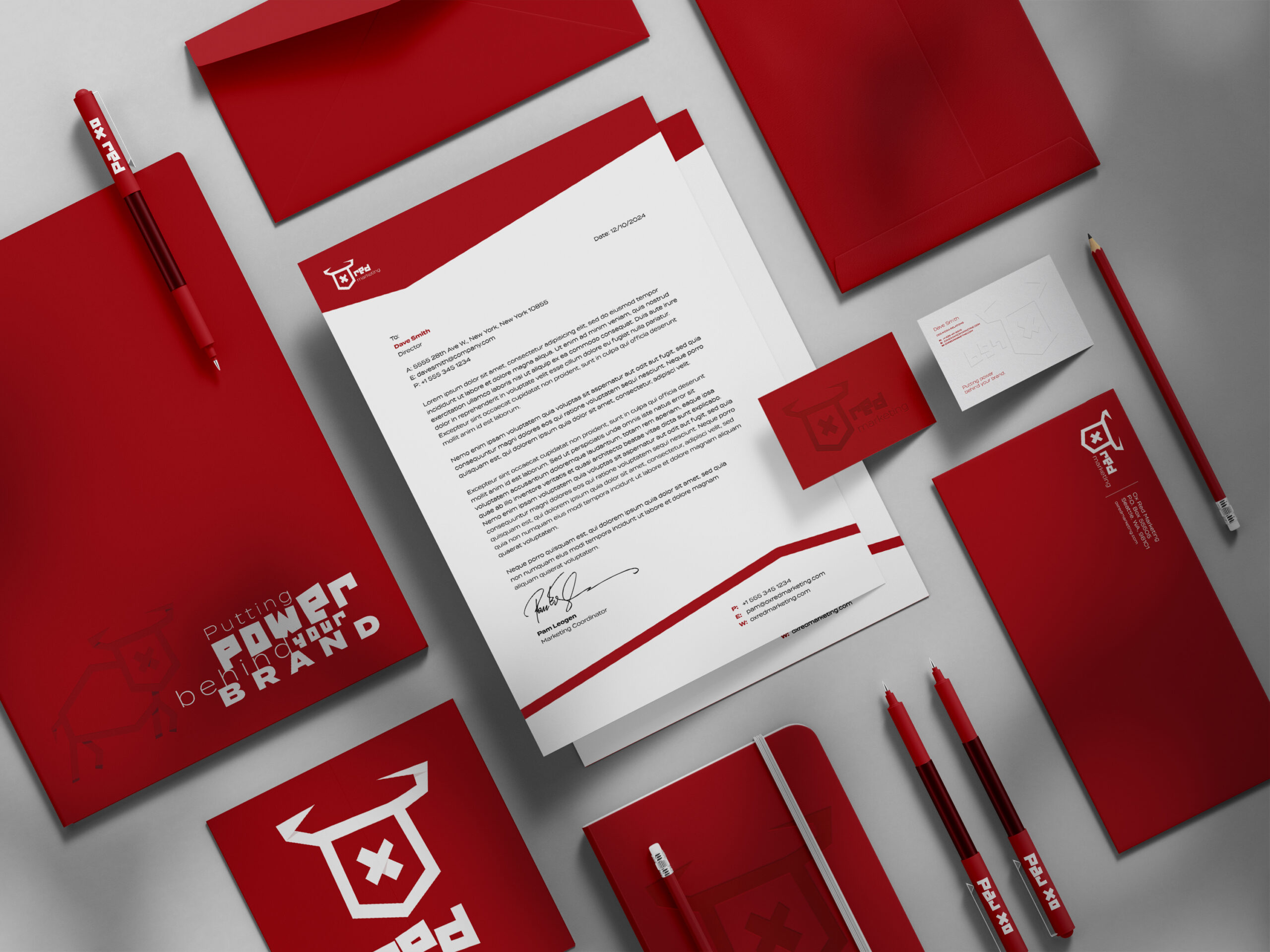
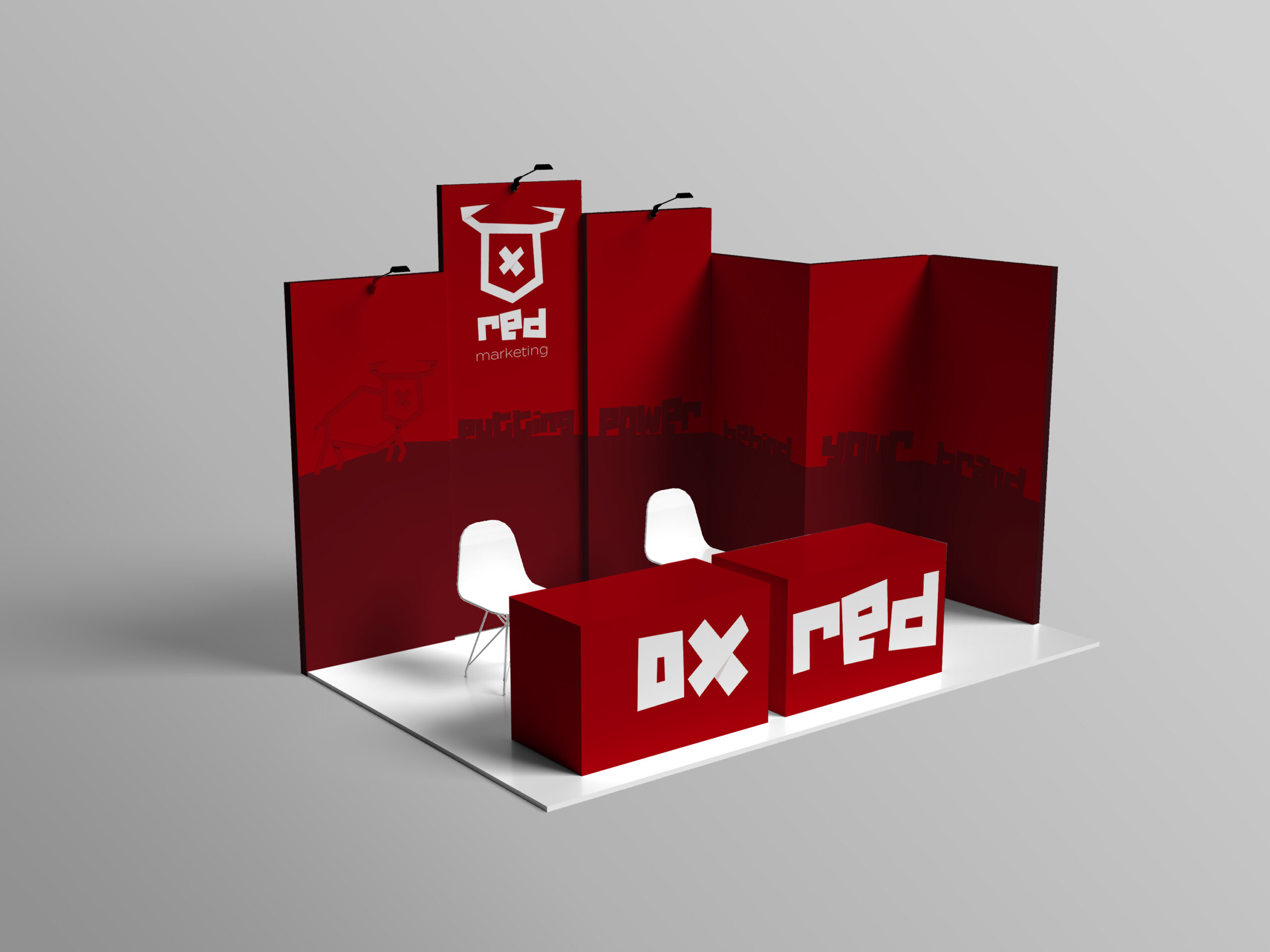
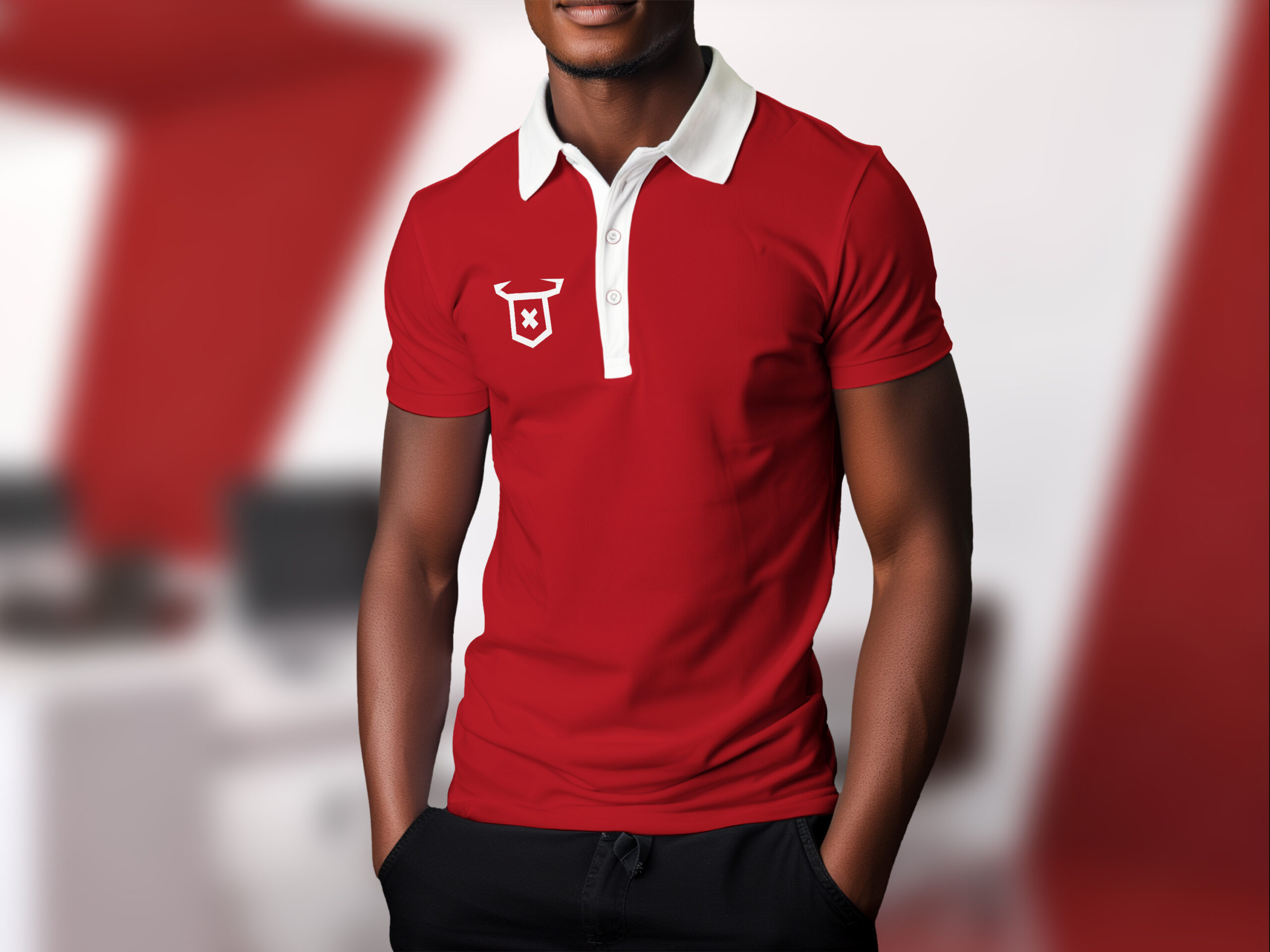
An event marketing brand doesn’t get the luxury of showing up in only one context. The same identity has to hold its own on a business card and on a forty-foot event banner, in a digital proposal deck and on a printed badge scanned in under a second by someone walking fast. That range is really the final test of any identity — not whether it looks good in isolation, but whether it survives being stretched, shrunk, printed on the wrong stock, or thrown onto a screen at the back of a ballroom and still reads as confident. What follows is Ox Red Marketing’s identity doing exactly that: moving across formats without losing the boldness, the balance, or the unmistakable red that started the whole thing.
Ready to Start Your Own Project?
Every project starts the same way — a brand that needs to work in the real world, not just look good in a pitch deck.
If that's where you are, let's build a brand identity that holds up.