
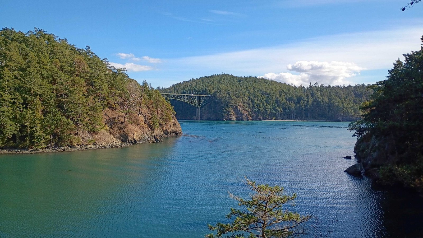
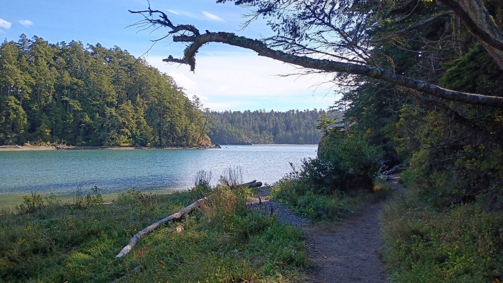
Late September, a warm Saturday afternoon, Deception Pass. We had been out there many times, but it had been a few years and the youngest had never seen it, so we took the afternoon and walked the Lottie Point Loop, which has the best views in the area. The bridge is the thing everyone photographs. I spent most of the walk looking at a tree with a monochromatic palette and more visual interest than most brands manage with six colors.
One hue, seven values
Pacific madrone grows in among the firs along that stretch of trail, and it does not behave like anything around it. The bark peels. It lifts away in curling papery sheets, the way old paint comes off a south-facing wall, and what it reveals underneath is not bark at all. It is smooth and almost skinlike, with no grain or tooth to it.
The color is what I kept coming back to. On one trunk I could follow the whole range: pale green-yellow where the skin was newest, then apricot, then a dull salmon, then terracotta, then a deep rust on the oldest curls, with edges dark enough to read as brown-black. One hue. Two at the outside. Pulled across six or seven values on a single continuous surface.
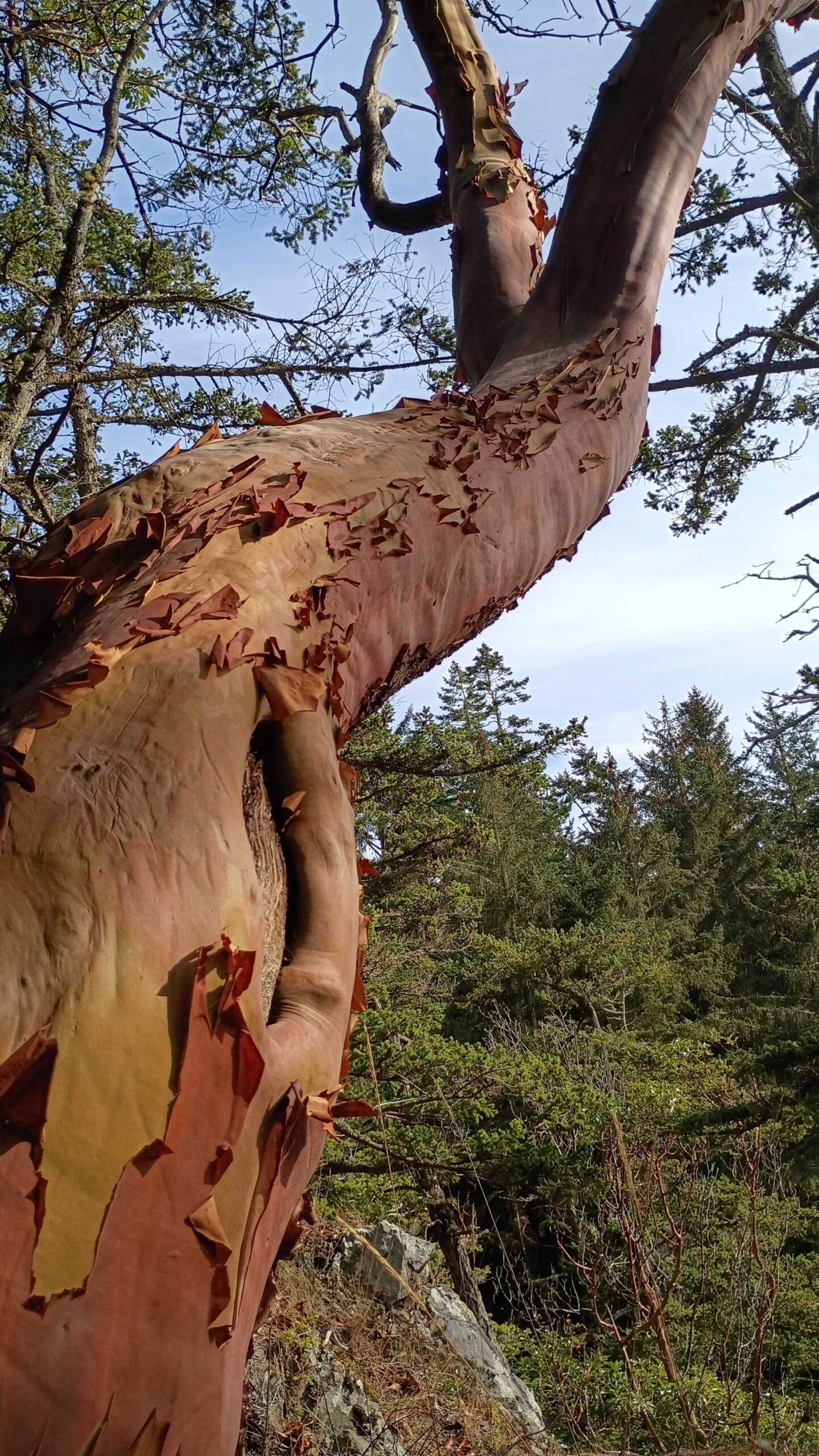
That is a monochromatic palette, and it is the least flat thing on the hillside.
Where a monochromatic palette gets its variety
A monochromatic palette usually fails by going quiet. Strip the hue variation out and the thing often loses its edges, everything settling at the same weight, nothing stepping forward. The madrone has no such problem, and the reason is worth sitting with. The hue is holding still. The surface is not. Where the bark has curled away there is a hard edge and a cast shadow. Where it has not, there is a smooth plane taking the light full on. The variety is real. It just is not being carried by color. It has been handed off to texture.
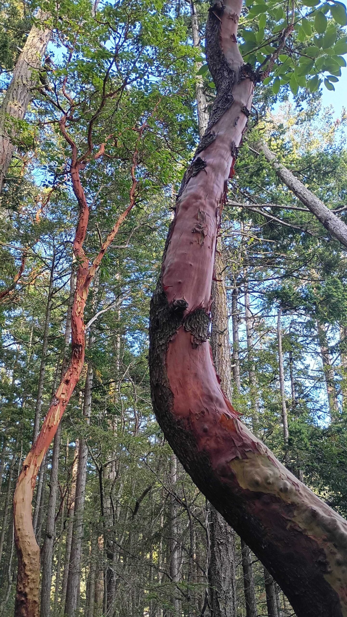
The shape runs the same play. Every other trunk on that slope is a straight gray-brown vertical, evenly spaced, more or less interchangeable. The madrone leans and bends, one long S through a grid of uprights. It is the only curve in view, and it does not need a second color to be the first thing you see.
The same lesson on the beach
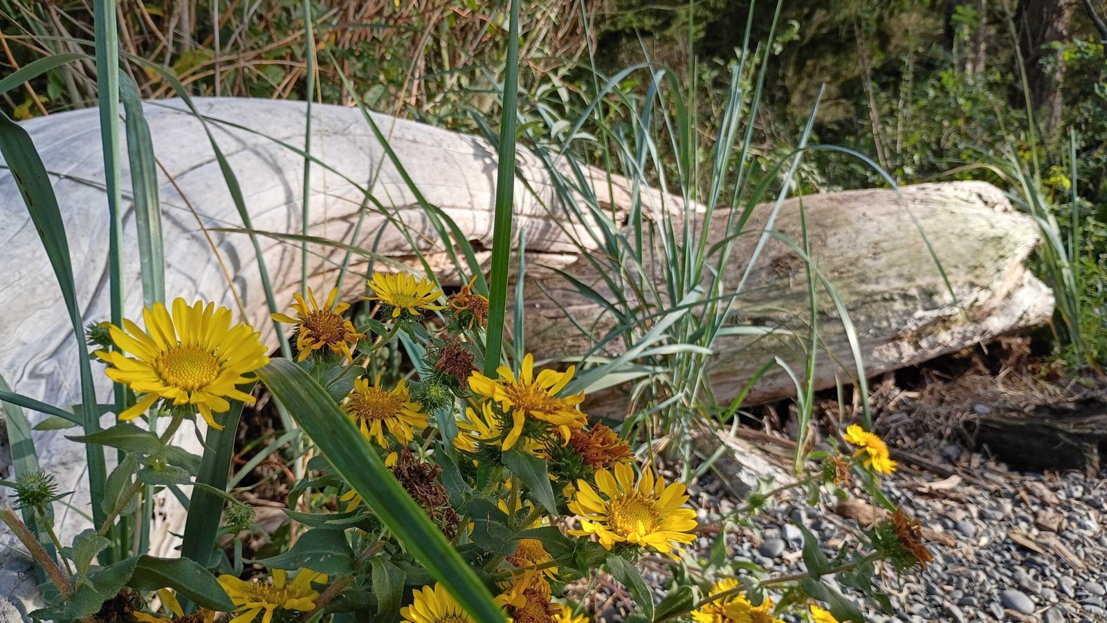
Further along, down on the cobble, the idea turns up in another form. Driftwood logs bleached to a pale silver-gray, worn smooth, the grain still legible as fine parallel lines. Rounded gray stones. Blue-green dune grass standing in stiff blades. And then, filling maybe a twentieth of the view, a stand of gumweed in a hard saturated yellow, the spent heads already gone rust-brown. That yellow is not competing with anything, because there is nothing else in the frame within reach of it.
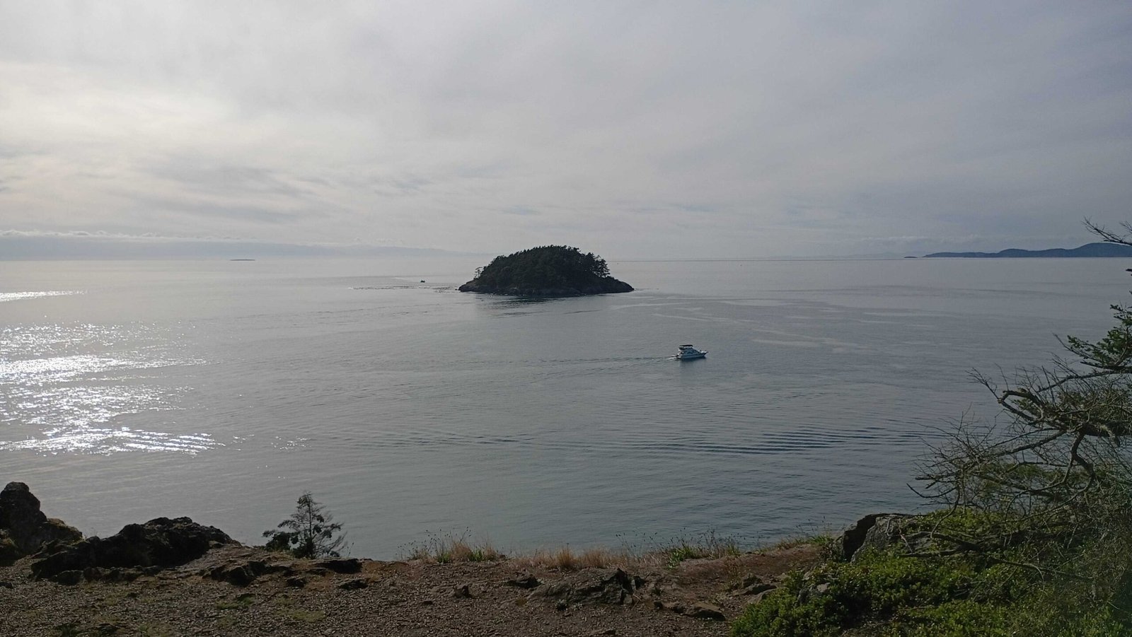
By late afternoon the light had flattened out. Looking west over the strait, the whole view had dropped to pewter. Sky and water sat at nearly the same value, one dark island offshore, the headlands behind it stacked in paler and paler grays. A single white boat. That was the entire color story, and it still read as deep space, because each ridge behind the last had given up a little contrast and taken on a little blue.
Brands already doing this
Filson has run a version of the madrone palette for decades: tan, rust, olive, not much else, varied by material instead of by hue. Waxed cotton against bridle leather against brass hardware. The range looks wider than it is. Tanner Goods, down in Portland, leans on it harder still. A good share of their visual identity rides on untreated vegetable-tanned leather, which performs the madrone trick without help, darkening from pale straw to deep russet as it wears. Neither brand is working with many colors. Both read as though they are.
The brands that could take more from this are the ones already sitting on a single-hue material and reaching past it anyway. A coffee roaster is the clearest case. Roast level is one color across its full value range, raw green through cinnamon to near-black, and most roaster packaging ignores that and hands each blend an arbitrary bright color instead. The material was already doing the work. The same goes for ceramics studios, brick and tile makers, and anyone selling wood or leather on its own merits.
What to look for
The thing worth noticing outdoors is not the striking color. It is what a landscape does on the days it has almost no color to spend. Narrow the hue and the variety has to come from somewhere else: an edge, a shadow, a weight, the direction one shape runs against its neighbors. A monochromatic palette is not a smaller set of decisions. It is the same number of decisions, relocated somewhere less obvious, where they are harder to fake.