
The Boeing Store
The Design Work
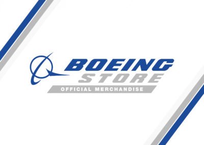
Getting invited to pitch a rebrand for a company as tightly controlled as Boeing is rare, and the brief was simple in theory: make The Boeing Store actually feel like it belongs to Boeing. In practice, the retail brand had drifted from the parent company’s visual language — a mismatch that’s an easy thing to spot and a genuinely hard thing to fix without losing the store’s own personality. The concept built for the pitch pulled the store’s identity closer to Boeing’s own precision-engineered aesthetic: a logo with the same restraint and confidence as the aircraft it represents, a color palette drawn from Boeing’s actual brand system rather than a generic aviation cliché, and a full redesign of the website, banner ads, and email newsletter to carry that same discipline across every touchpoint a customer would actually see. Boeing chose a different direction in the end. What’s here is the version built on the bet that the store should look like it came from the same company that builds the planes.











Ready to Start Your Own Project?
Every project starts the same way — a brand that needs to work in the real world, not just look good in a pitch deck.
If that's where you are, let's build a brand identity that holds up.