
Moose Cola
The Inspiration
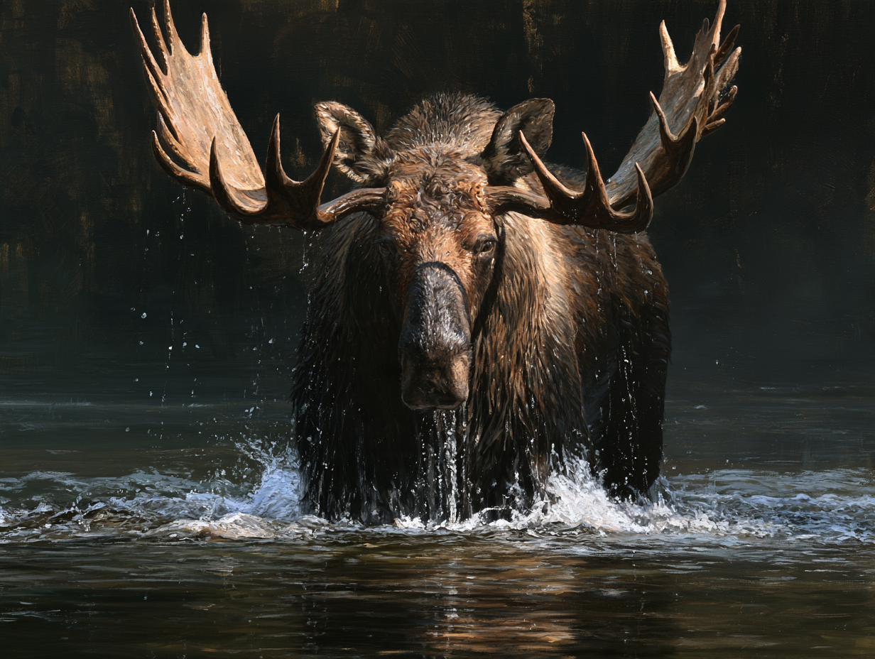
Every assumption about this brief turned out to be backward. A cola named after a moose reads, on paper, like a playful, family-friendly soda — the kind of category where a cartoon mascot practically designs itself. But the owner developing this recipe wasn’t chasing that shelf at all. He’s an avid big-game hunter who built his own cola specifically for men who’d rather crack open something with attitude than another beer at the end of a hunt. That’s a completely different room to design for. Nobody standing around a fire after a long day in the field wants to be handed a drink that looks like it belongs to a kids’ menu. The real audience already knows what a genuine trophy looks like, and a friendly cartoon moose would have read as a joke rather than a nod. Once that clicked, the whole direction became less about drawing a moose and more about drawing the moose a hunter actually respects: something that could hold its own next to the animal on the wall.
The Logo
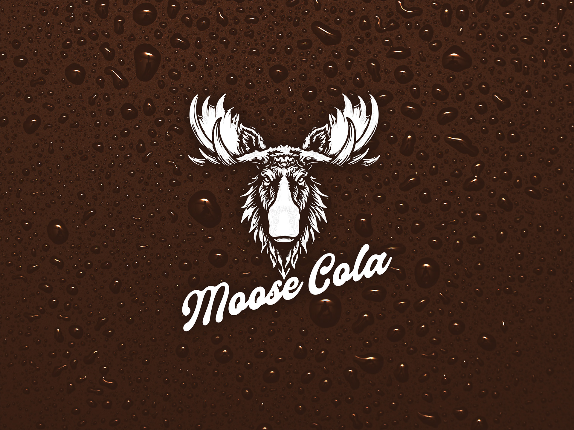
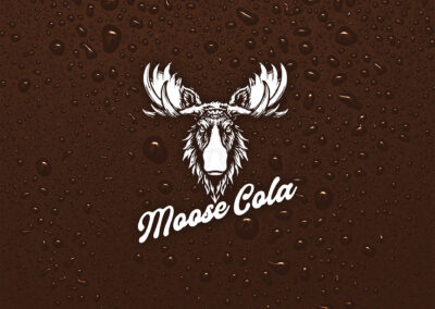
A cartoon face was never going to work, and neither was the other obvious fallback: a clean antler silhouette, the kind stamped on half the outdoor gear in existence. Neither one has any actual presence. What a real bull moose has, staring you down across a clearing, is intimidation — a straight-on stare, antlers angled forward like they’re already closing the distance. That’s the pose the mark takes: the moose faces the viewer head-on, fur rendered in rough, hand-drawn detail rather than a flat vector shape, eyes locked forward the way a territorial animal actually looks at a threat. The real trick sits at the bottom of the mark, where the muzzle narrows and quietly becomes the neck and cap of a cola bottle — the animal and the product occupying the same few inches of line, so the logo is doing double duty without announcing it. It’s a mark built to be respected rather than liked, which is exactly the reaction the actual customer is looking for.
The Color Palette
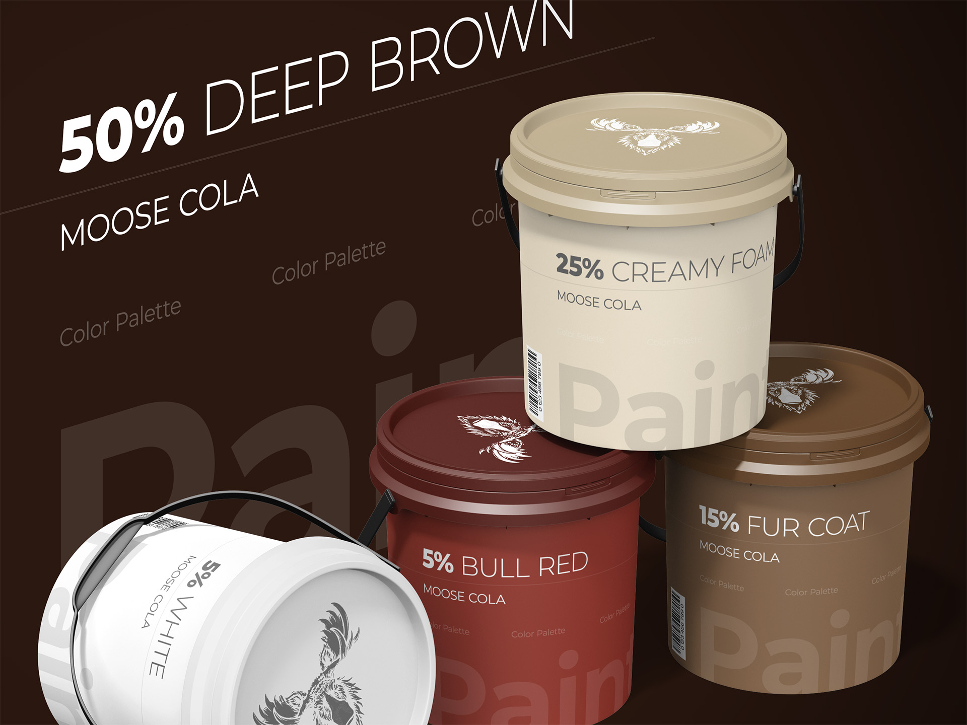
Moose Cola never needed an invented palette because the product basically supplied its own. Cola runs deep brown, moose fur runs somewhere between brown and cream, and a bull moose’s coat carries just enough reddish undertone in the right light to close the loop. So the identity leans on exactly those colors: a rich, near-black brown for depth, a warm cream for contrast, a thin edge of deep red pulled from the animal itself, and white for the mark. Nothing in that list required a mood board — it’s the actual color of the two things the brand is named after, sitting next to each other. That kind of palette doesn’t need explaining to the customer either. It just looks like it was always supposed to exist, which is exactly the point for a brand built on being taken seriously rather than noticed.
The Typography
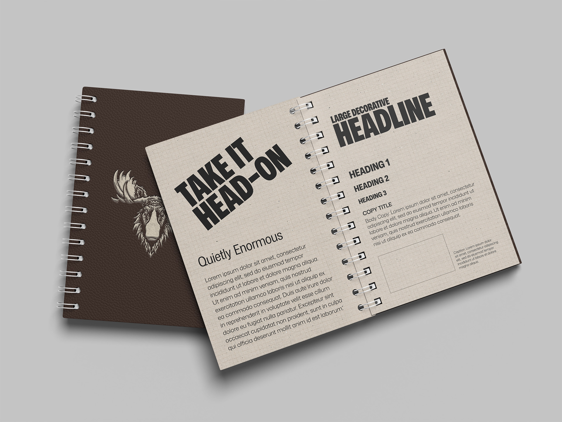
The wordmark under the moose is a classic cola script, close enough to the genre’s most famous example that a client could technically prompt an AI to generate something similar. That’s not a flaw here — it’s the point. Nobody drinking Moose Cola around a fire is scrutinizing kerning. What they’ll register, without thinking about it, is that the script instantly reads as “cola” the same way a red can instantly reads as a certain other soda, borrowing decades of familiarity instead of fighting for new ground. Restraint mattered more than originality in this one spot: the type’s entire job is to sit quietly under a mark that’s already doing the heavy lifting, confirming what the product is without competing with the moose for attention.
The Design Elements
Most hunters aren’t flashy, and neither is a beer label at a campfire, so the brand couldn’t be either. The whole identity works because it refuses to draw extra attention to itself: one mark, one ink color, no secondary graphics competing for space. That single-color white logo is what makes the brand genuinely flexible — it reads clean printed straight onto a deep brown bottle, and it would read just as clean stamped on a cooler, a hat, or a tailgate without ever needing a redesign for the surface. The goal was never to make Moose Cola stand out in a cooler full of beer; it was to let it fit in comfortably enough that nobody blinks when someone reaches for it instead. Simplicity here isn’t a design shortcut, it’s the actual brand strategy: the less the mark tries to prove, the more it reads like something that’s always belonged in that circle, rather than a new product trying to earn its way in.
The Examples
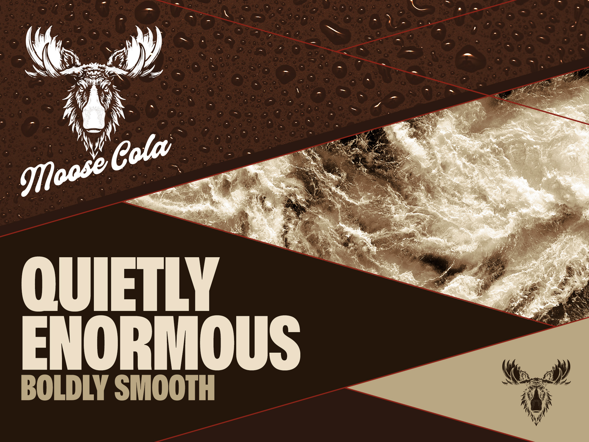
A logo built this simple has to prove itself in exactly the situations where most brands overcomplicate things: a bottle cap, a cooler lid, a hat brim, a single screen-printed line on the back of a jacket. Because the mark is one color and reads clearly at almost any size, it never needs a simplified backup version for small spaces the way more detailed logos often do. What follows is that same white moose showing up across the kinds of surfaces this brand actually lives on — not polished lifestyle photography, but the real, slightly rough-around-the-edges places a product like this gets used: coolers, trucks, camps, and the occasional bottle sweating condensation next to a fire.


Ready to Start Your Own Project?
Every project starts the same way — a brand that needs to work in the real world, not just look good in a pitch deck.
If that's where you are, let's build a brand identity that holds up.