
The Alder Family Homestead
The Inspiration
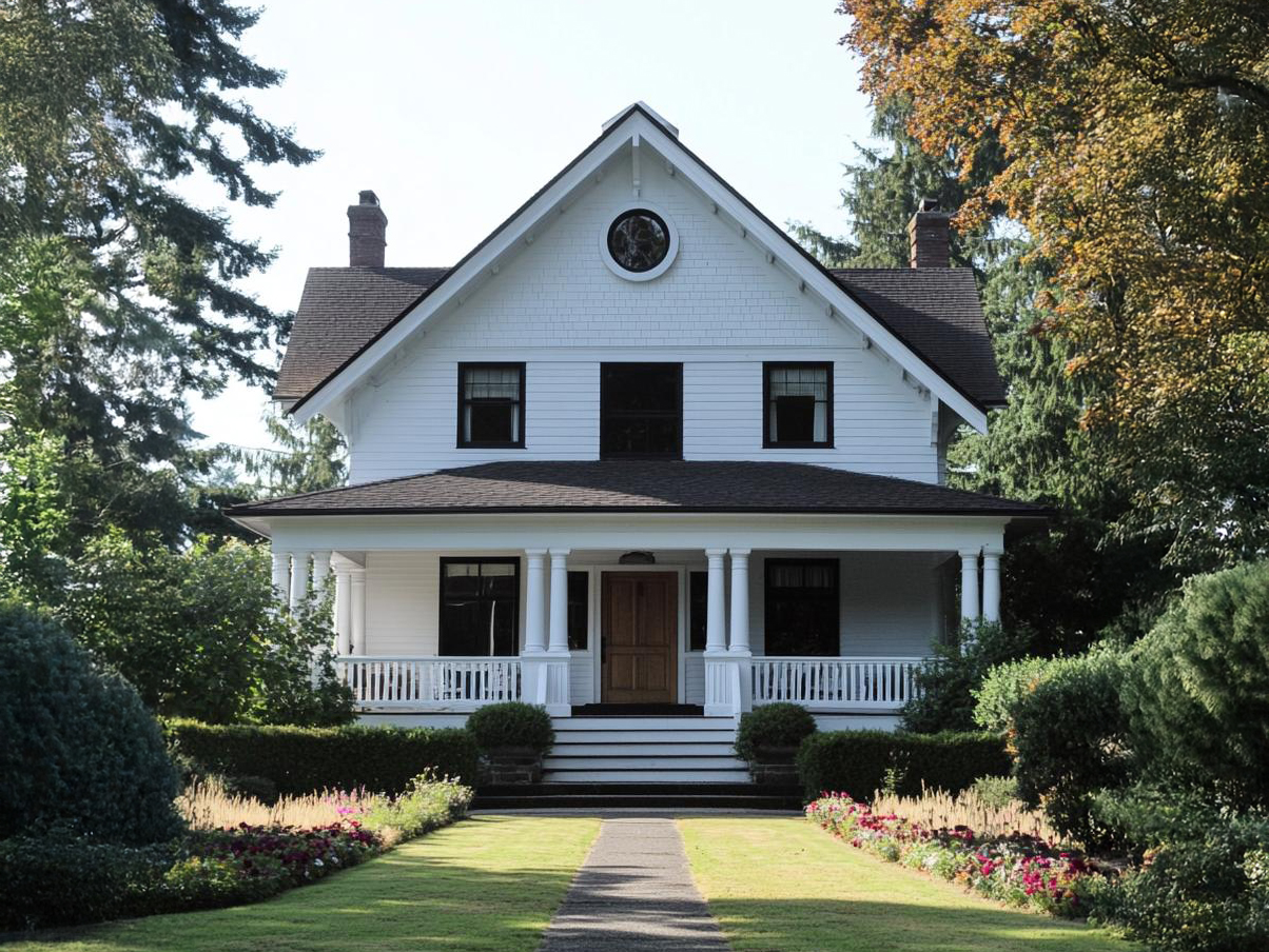
A homestead brand built entirely around microgreens would have a shelf life exactly as long as that product line. The Alders needed something that could carry the family name through whatever they grew into next — eggs, preserves, cut flowers, anything a homestead naturally expands toward over time. That meant the identity couldn’t live inside the product at all. It needed to live inside the place. Spending time researching and visiting small homestead operations, one thing stood out more than any crop or coop: the houses themselves. Craftsman-style farmhouses, built solid and unfussy, with the kind of warmth that comes from a home actually being lived in rather than staged. That was the real find — not a vegetable, but a feeling. If the brand could borrow that same warmth, the same sense of a family that’s been doing this a while and plans to keep doing it, the identity would outlast any single product on the label.
The Logo
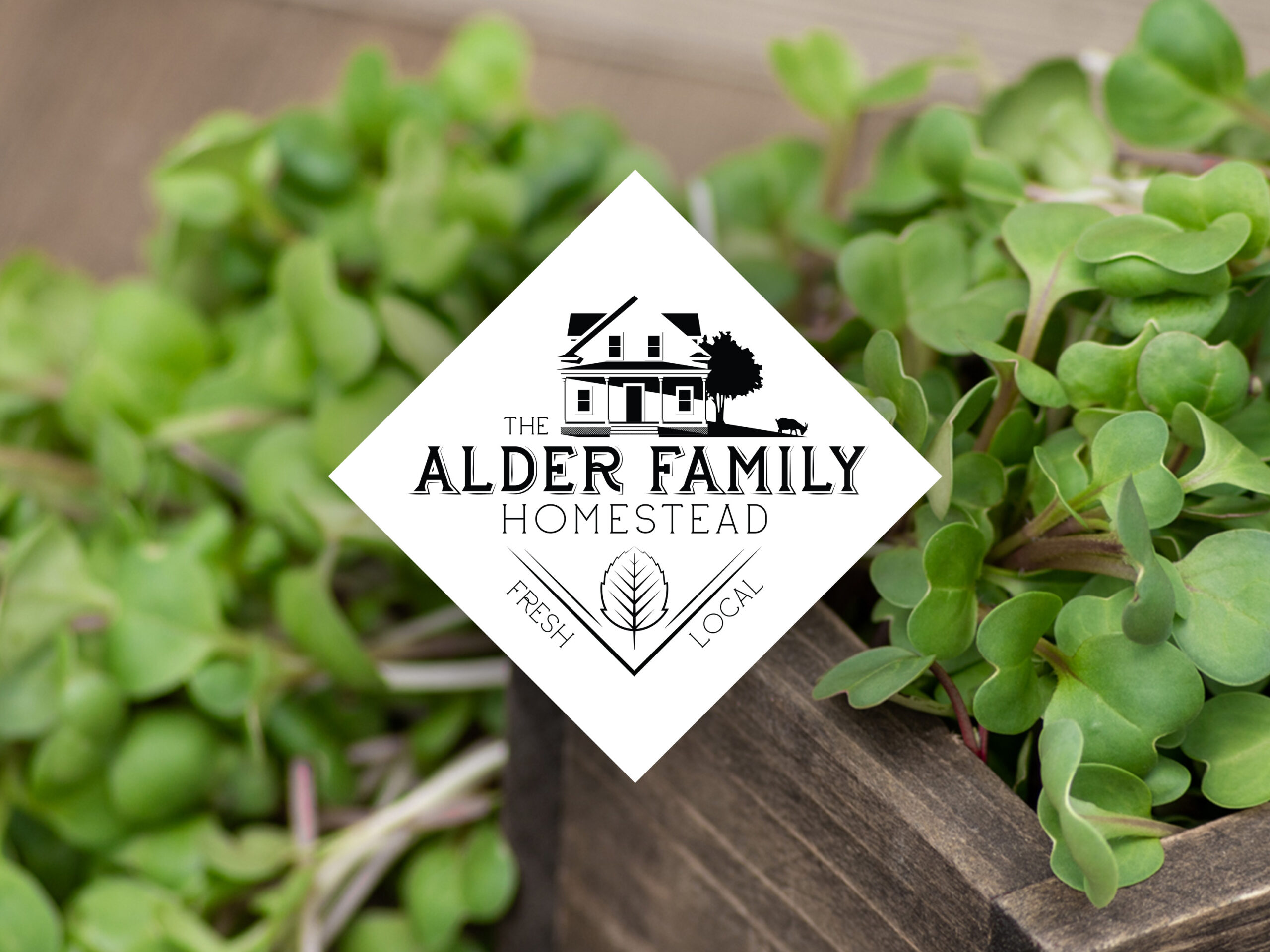
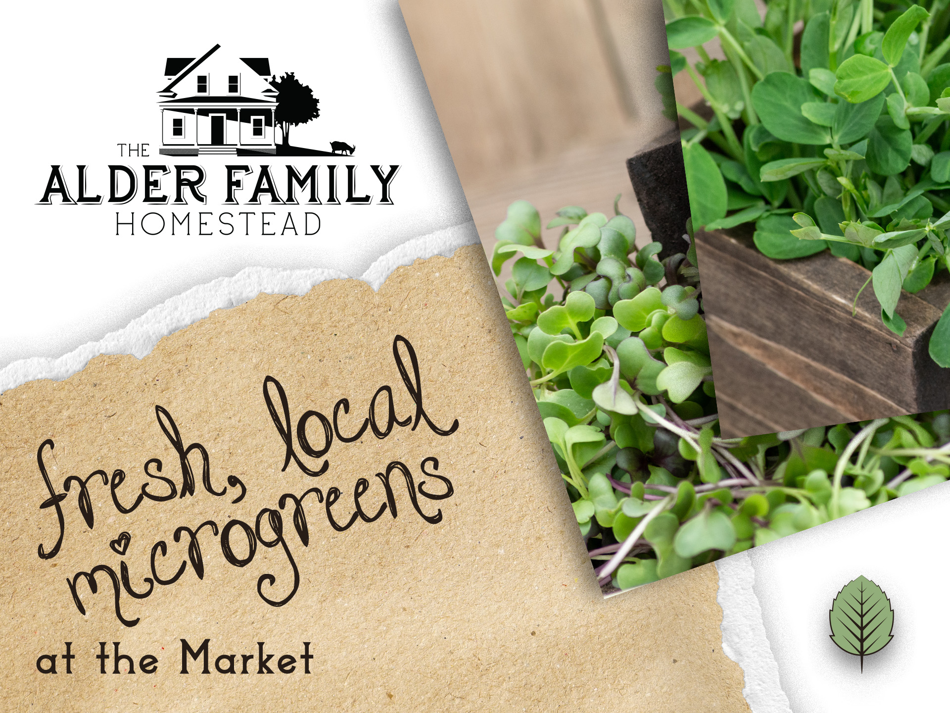
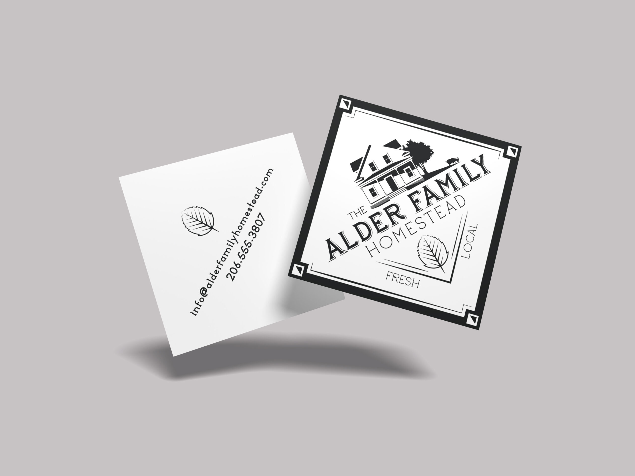
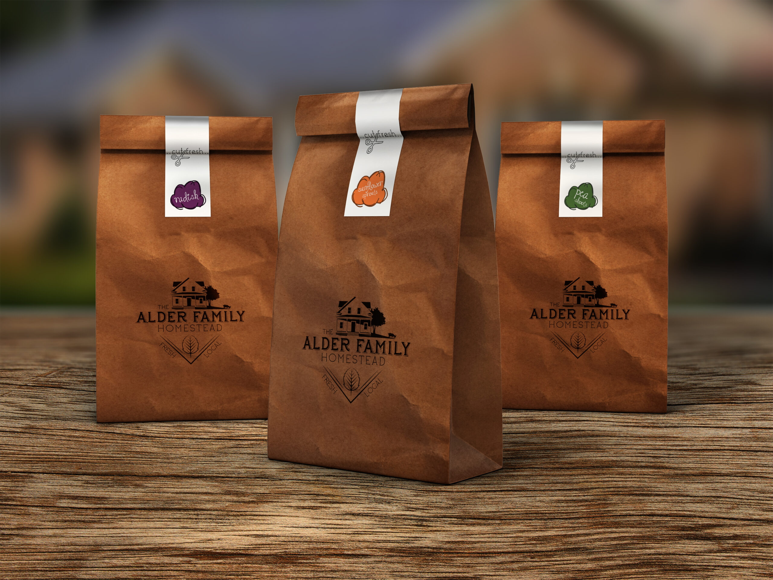
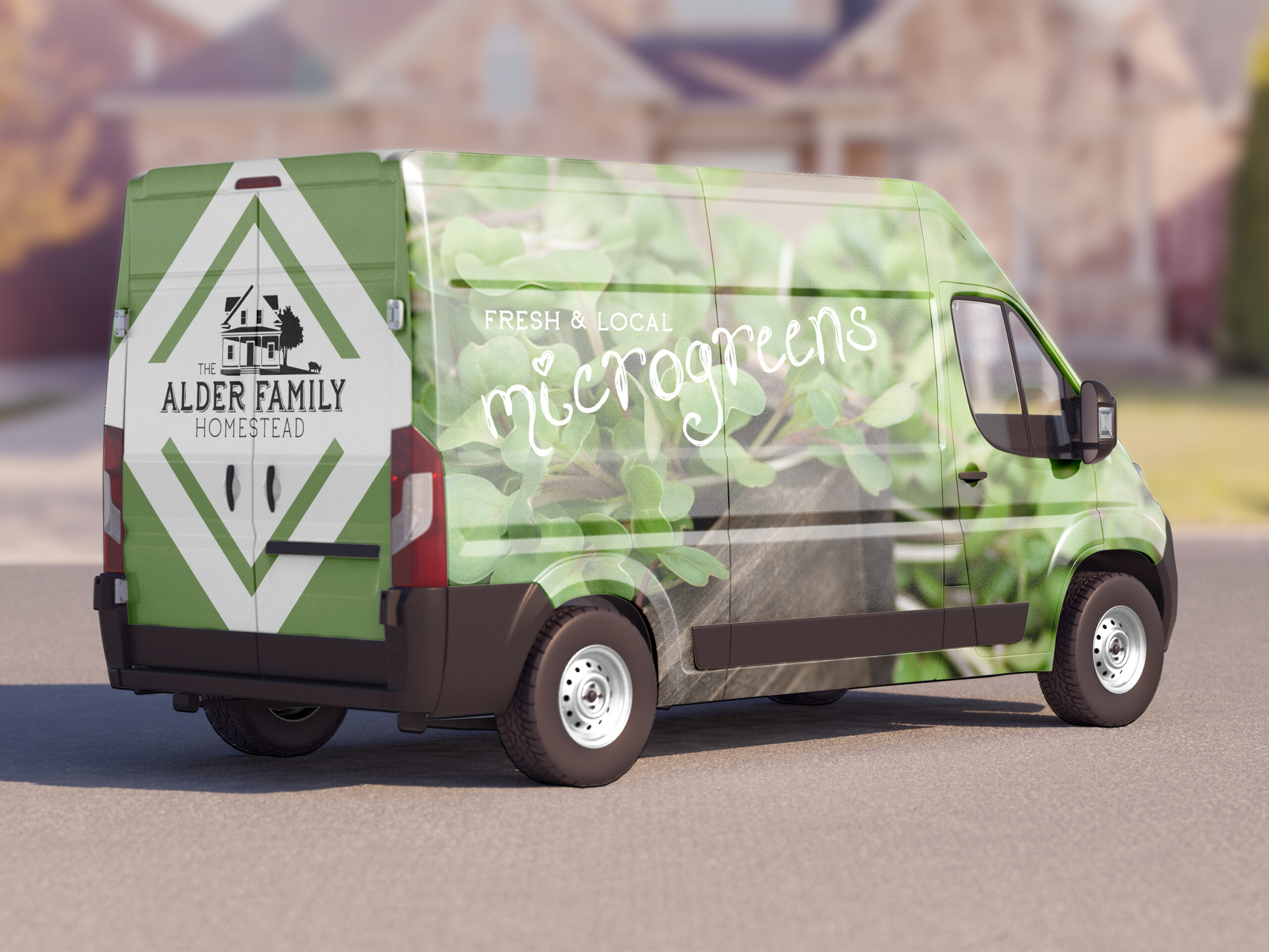
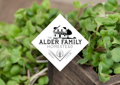
Once the direction was clear — build the house, not the vegetable — the level of detail that made those Craftsman homes so warm in real life couldn’t survive being simplified into a typical flat icon. So the mark leans into that detail instead of fighting it: a fully rendered farmhouse, gabled roof, porch columns, a shade tree, even a goat grazing off to the side, all drawn in fine black linework. It reads less like a logo and more like a woodcut illustration you’d find on an old farm sign, which is exactly the point — nothing about it should feel new. The whole scene sits inside a diamond, the same shape as the sticker the family already presses onto the brown paper bags they deliver their products in, so the logo doesn’t introduce a new symbol so much as formalize one they’d already been using by hand. Below the house, the wordmark carries the family name in a bold, dimensional custom face, with “Homestead” set quieter underneath it — the house does the storytelling, the type just signs it.
The Color Palette
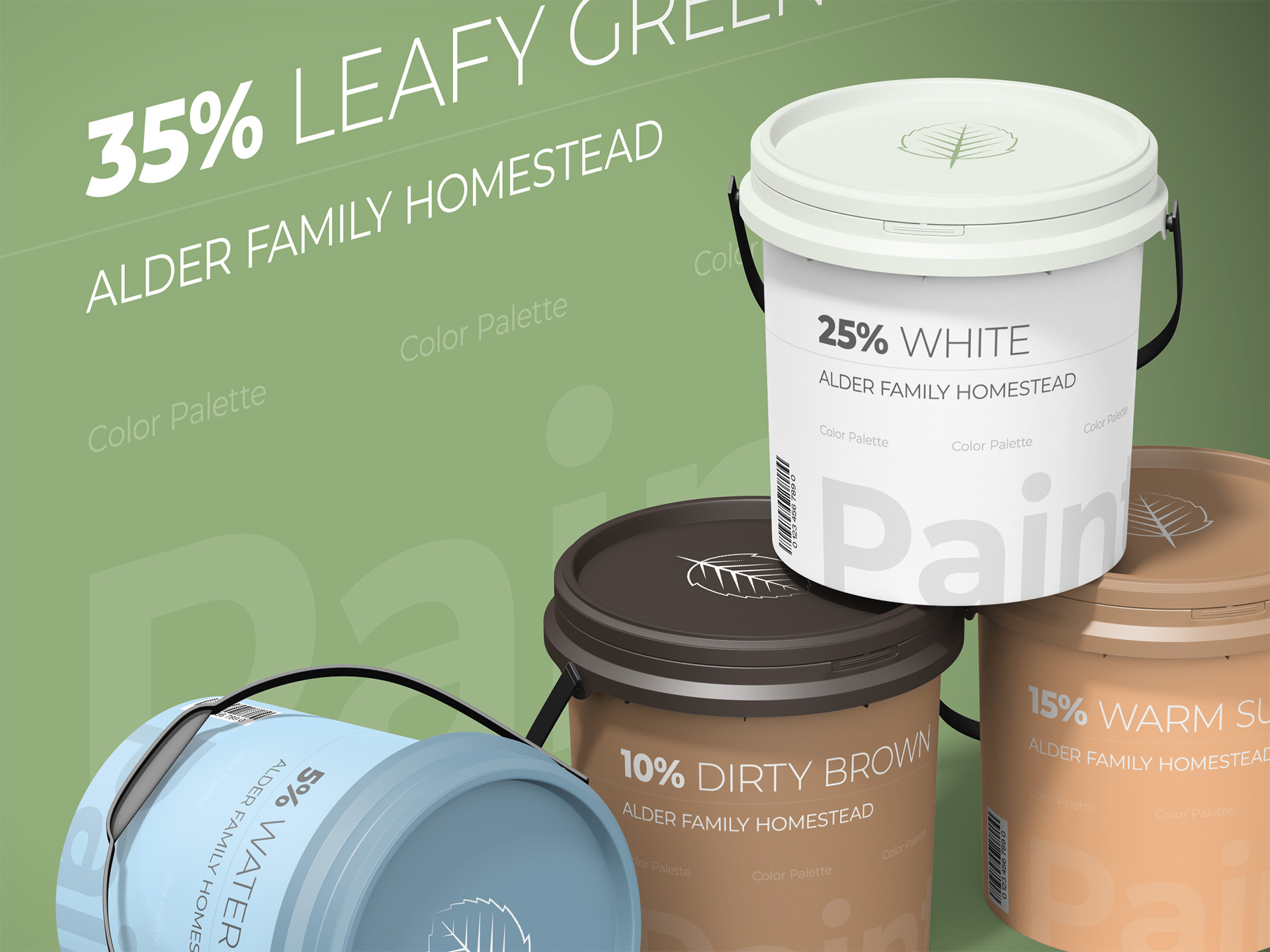
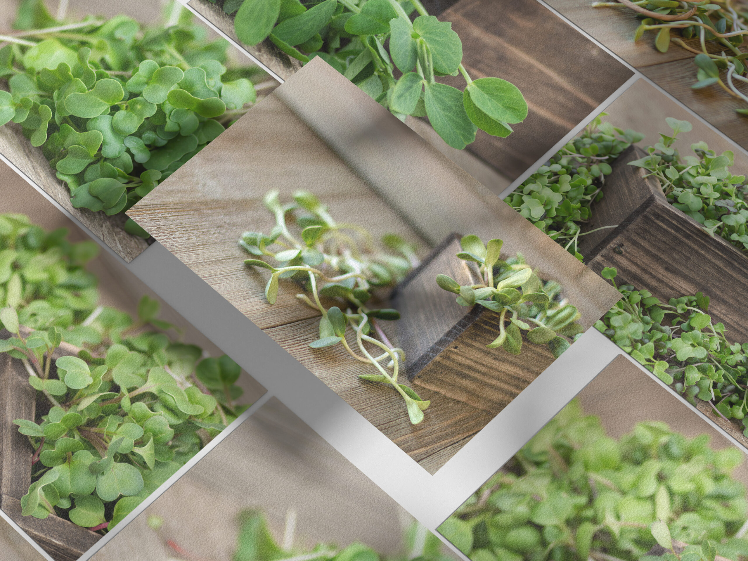
Photography was always going to carry the color in this identity, the same way it does for a lot of food-forward brands, so the logo itself stayed strictly black and white — a choice that also happens to be the most traditional one available, which suited a brand built on feeling timeless. The one true brand color came straight from the product: a green pulled directly from the family’s own sunflower sprouts, the kind of shade that only exists because someone actually grew and photographed the thing themselves rather than picking a green off a swatch book. A handful of supporting tones round out the palette for the moments a single green isn’t enough — a warm peach, a soft sky blue, a leathery tan, and a near-black espresso brown. Together they read like something pulled from the farmhouse itself: sun, soil, wood, and sky, sitting quietly behind whatever the camera actually captures.
The Typography
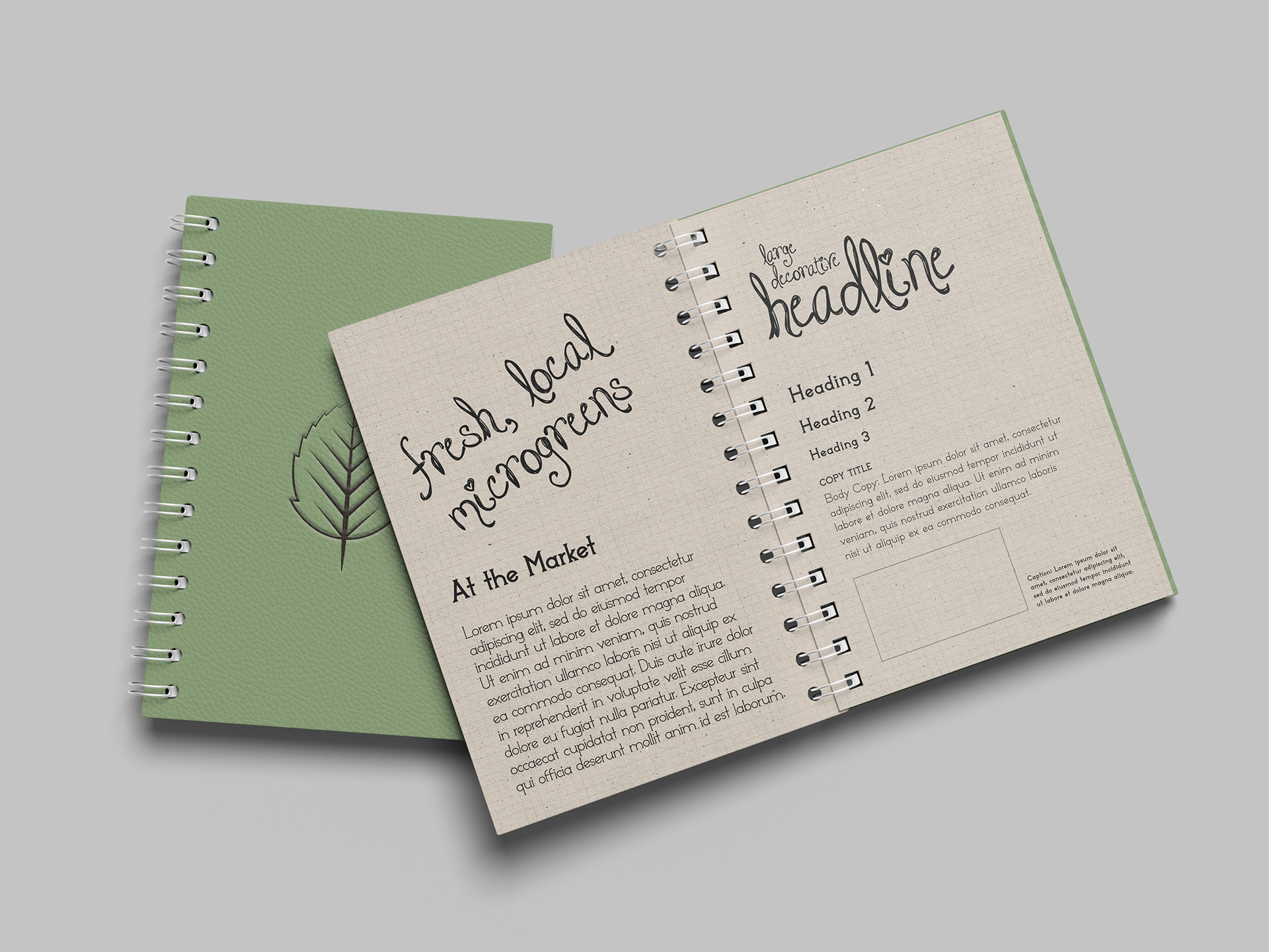
Nothing off the shelf was going to feel personal enough for a brand built around one family’s actual home, so the wordmark got its own custom typeface, built from scratch and named Modern Homestead. Its letterforms borrow structure straight from the house in the logo — the same proportions, the same sense of weight resting on solid footing, so the name and the illustration feel like they were designed by the same hand rather than paired together after the fact. A lighter companion serif carries the smaller supporting text: “The,” “Homestead,” “Fresh,” and “Local,” giving the bold custom face room to be the loudest thing on the label without the rest of the type competing with it. It’s the kind of typographic decision most people will never consciously notice, which is exactly the goal — the type is meant to feel like it’s always belonged to this family, not like it was built for them.
The Design Elements
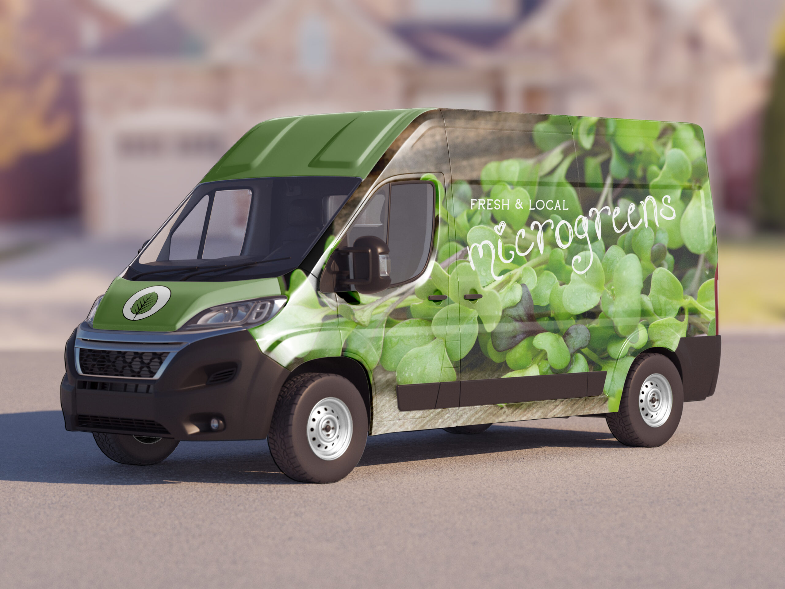
Detail this fine only works if it’s held together by real discipline elsewhere, or the mark turns cluttered the moment it leaves a clean, large-format canvas. The house illustration always stays whole rather than getting cropped or simplified for smaller uses — instead, a second, smaller mark takes over: an alder leaf, standing in for the family name wherever the full house is too much detail to survive the space. That leaf shows up bracketed by two simple angled lines forming a small banner, with “Fresh” and “Local” sitting on either side of it — a compact badge that carries the brand’s values even when there’s no room for the story behind them. Between the full house mark and the leaf, the system covers everything from a delivery bag sticker down to a social media avatar without ever needing to invent a new symbol for a new size. It’s built the way a real homestead operation actually works: one core identity, scaled up or down depending on what the moment calls for, never simplified so far that it stops feeling handmade.
The Examples
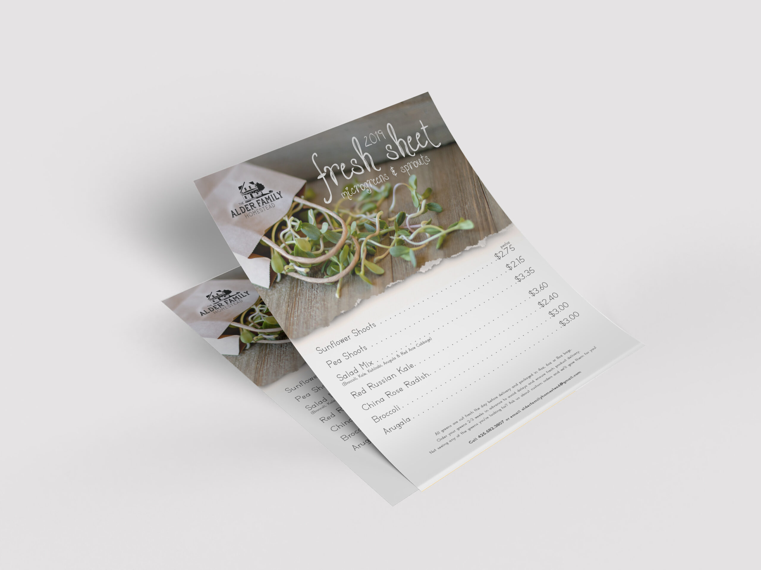
A brand built on this much detail has to prove it can survive contact with the real world — a farmers market table, a restaurant’s walk-in cooler, a bag of sprouts handed across a counter. The full house mark earns its place wherever there’s room to let it breathe: packaging, signage, anything with enough surface area to reward someone for actually looking closely. The alder leaf takes over everywhere else, doing the quiet work of staying recognizable at a glance without asking for much space to do it. What follows is that system doing exactly what it was built for — moving between a fully illustrated farmhouse and a single leaf depending on the size of the moment, while the actual color and texture of the product does what a logo alone never could.



Ready to Start Your Own Project?
Every project starts the same way — a brand that needs to work in the real world, not just look good in a pitch deck.
If that's where you are, let's build a brand identity that holds up.