
Take a Hike with Mike
The Inspiration
Every hiking channel eventually reaches for the same visual shorthand — a compass, a mountain silhouette, a badge that could belong to any outfitter in any decade. Standing out inside that sameness meant solving a problem most channels never actually name: a logo built for a framed poster rarely survives being shrunk down to a thumbnail the size of a fingernail, buried between a dozen other videos fighting for the same click. The identity needed to hold its nerve at both extremes — instantly readable scrolling through a phone feed, and still worth wearing once it’s stitched onto a hoodie. That meant starting from how people would actually encounter it first: small, fast, competing for a half-second of attention before a thumb kept scrolling. Everything else — the color, the type, the composition — got built backward from that constraint, rather than designed big and hoping it would shrink down gracefully later.
The Logo
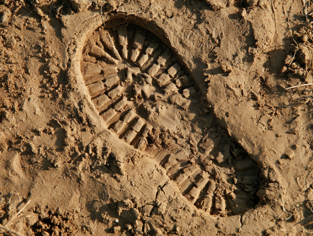
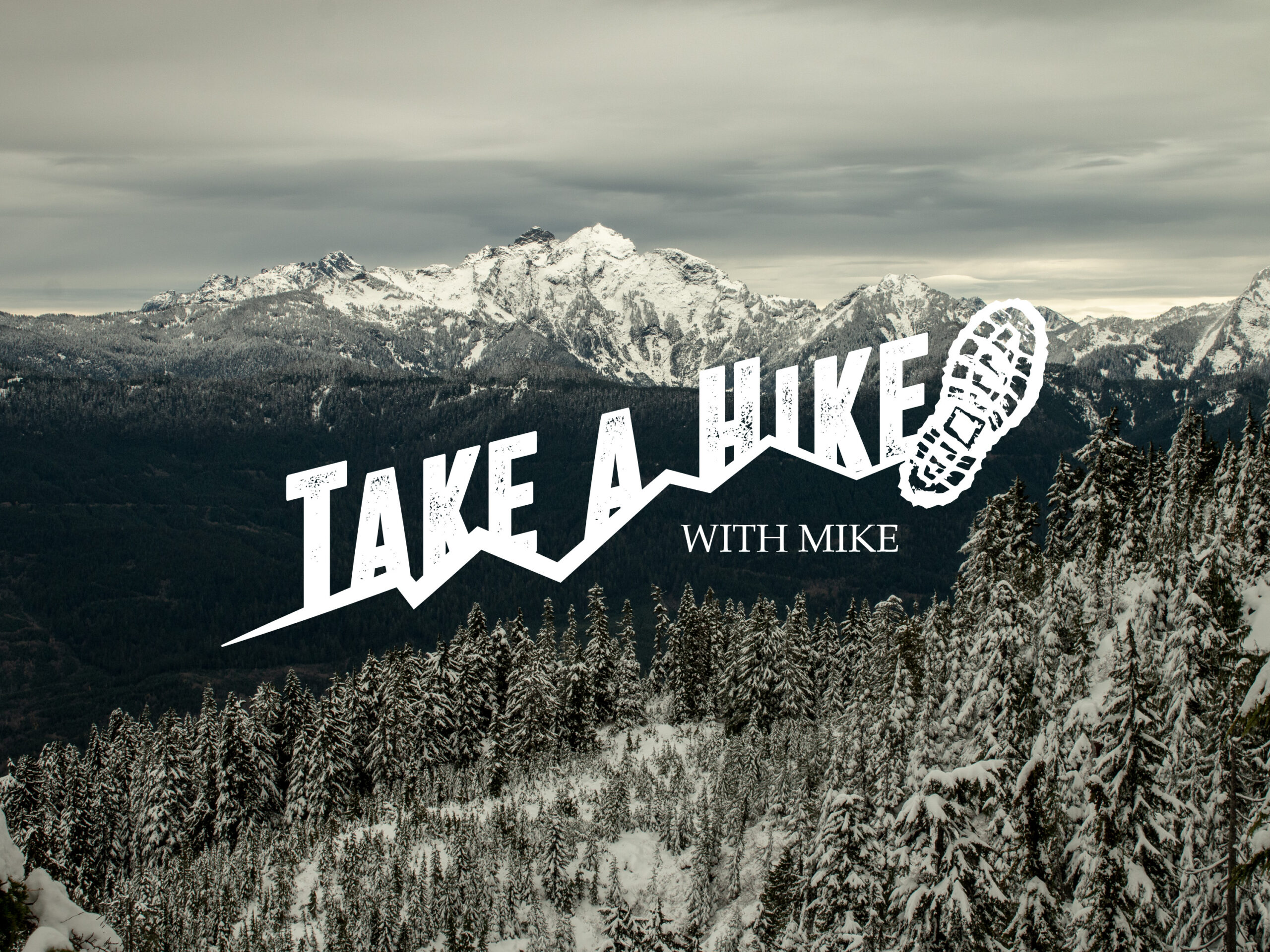
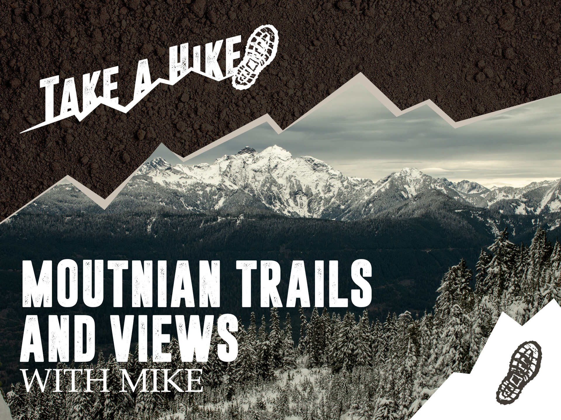
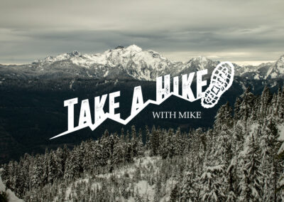
A boot print was the obvious starting point — and oddly, not many hiking channels actually use one, despite how directly it says “trail” without a single word. But a boot print alone runs a real risk: seen without context, it reads as a shoe brand’s mark, not an invitation into the outdoors. Something had to place that print somewhere specific, so no one mistook Mike for selling boots instead of an experience. The fix came from the wordmark itself: instead of drawing a mountain range as separate artwork, the letters of “Take a Hike” rise and fall like a ridgeline, climbing to a peak where a single boot print lands, tilted mid-stride, as if someone just stepped off the last letter and onto the summit. The type doesn’t sit next to the mountain — it is the mountain. That’s the kind of trick that reads as a flash of recognition rather than decoration, and it’s exactly what survives getting shrunk down into a thumbnail without losing the idea.
The Color Palette
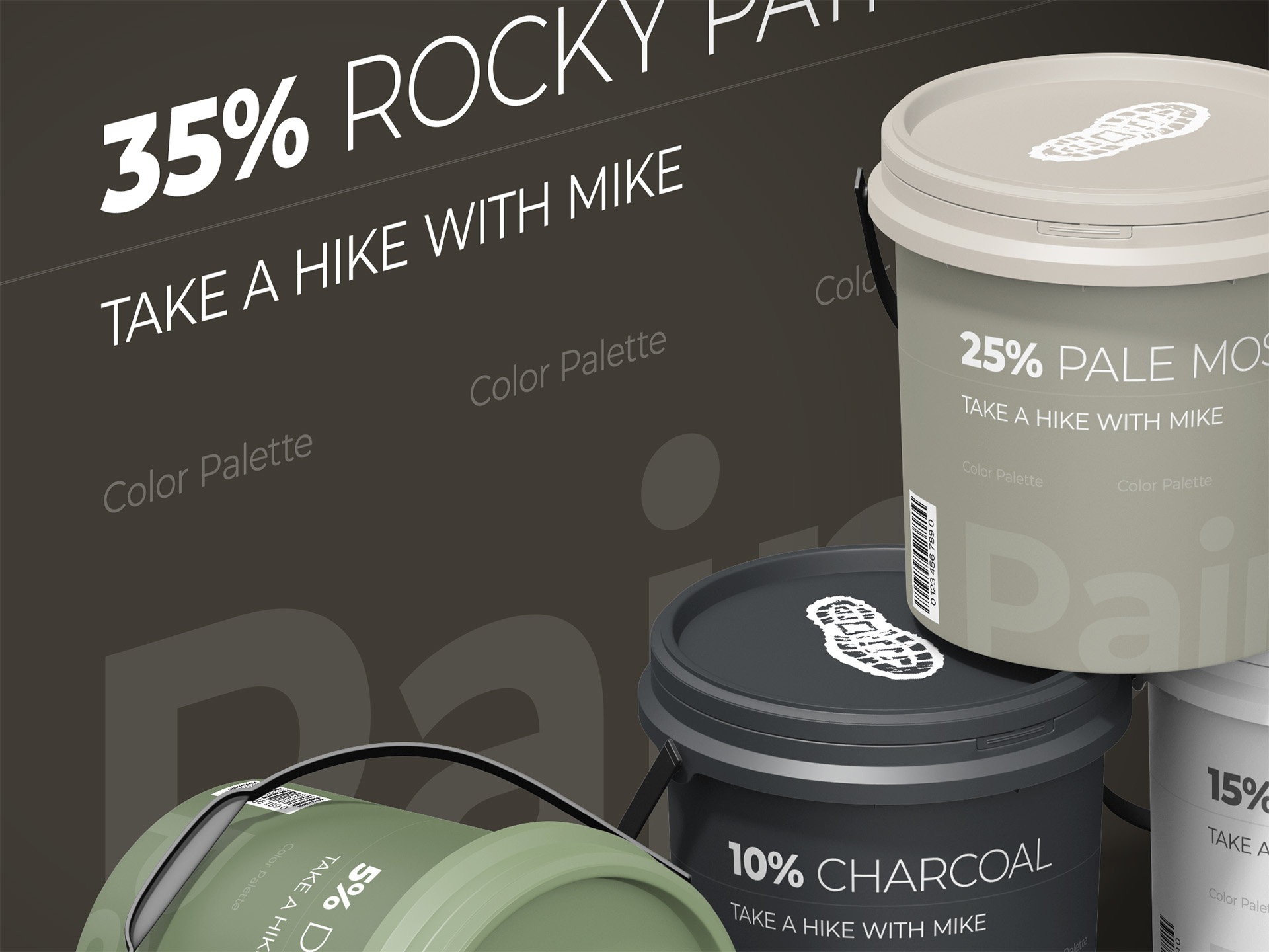
Photography and video do almost all of the color work here — every thumbnail, every upload, is already saturated with the actual greens and grays of the trail. That left the brand’s own palette with a narrower job: stay out of the way of the footage rather than compete with it. The five tones pulled for the identity — a mossy olive, a near-black charcoal, two warm neutral grays, and a deep earthy brown — were chosen because they already show up constantly in the imagery itself: tree cover, worn stone, overcast sky, packed trail dirt. Nothing in the palette is loud enough to fight a thumbnail for attention, which is exactly the point. The color system isn’t meant to be the star. It’s meant to sit quietly behind the logo and let the real trail photography carry the mood the brand is actually selling.
The Typography
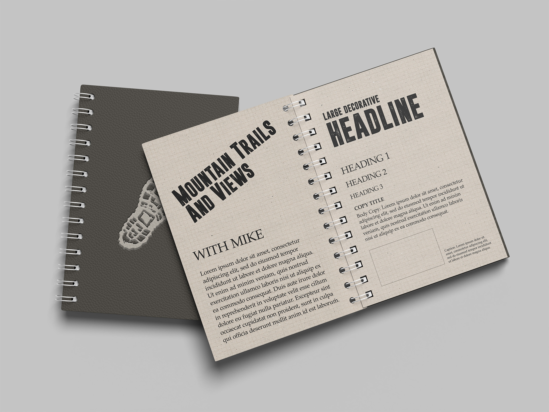
Type had one real job: survive being shrunk down to thumbnail size without turning to mush — and here it’s doing double duty as the mountains themselves. Dreamwalker carries the weight, its rough, uneven strokes giving “Take a Hike” the look of something worn in rather than printed fresh, with just enough texture to read as adventurous instead of corporate. Underneath it, “With Mike” sits in a slim, quiet serif — the kind of typeface that would disappear if it had to carry the whole logo, but works exactly because it doesn’t have to. That contrast is the real trick: one typeface loud enough to hold a thumbnail on its own, the other small enough to feel like a signature underneath it, the difference between shouting a brand name and simply signing your work.
The Design Elements
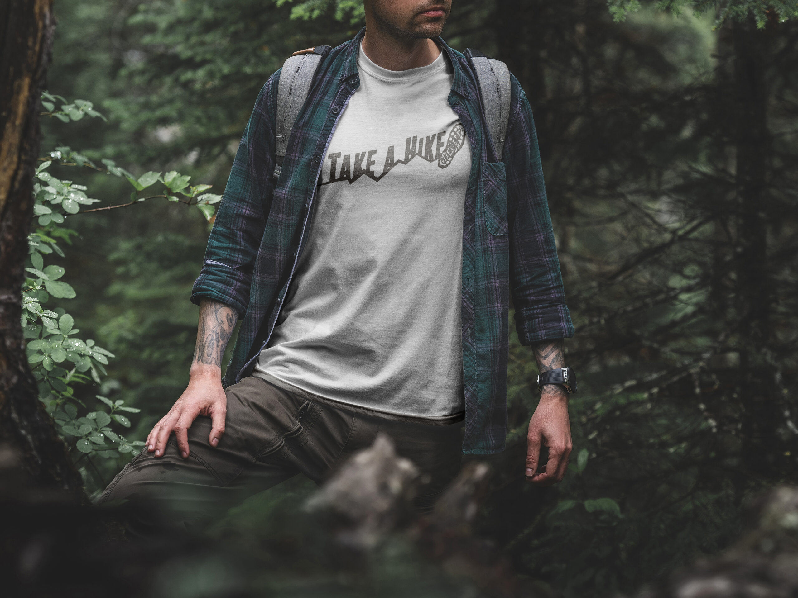
A mark built to work at two wildly different scales needs real discipline holding it together, or it falls apart the moment it leaves its home canvas. The system built around Take a Hike with Mike leans on a small number of non-negotiables: the boot print always anchors the composition, the mountain trail always leads toward it rather than floating independently, and Dreamwalker never gets swapped for a cleaner, safer typeface just because a piece of merch calls for something “simpler.” That discipline is what makes the mark recognizable whether it’s sitting at the corner of a YouTube thumbnail, printed across the back of a hoodie, or stamped small on a sticker. Every element earns its place by doing double duty — readable small, meaningful large — rather than existing purely for decoration. It’s a system built less for a polished style guide sitting untouched on a shelf, and more for a channel that needs its branding working overtime across a feed, a merch store, and everywhere in between.
The Examples
A YouTube brand lives or dies by how it performs in miniature — a channel icon, a thumbnail sitting next to a dozen competitors, a watermark in the corner of a video that’s already playing. But it also has to hold up at full size: a hoodie, a sticker, a trailhead sign taped to a backpack. That range is the real test of this identity, more than any single application on its own. What follows is Take a Hike with Mike’s mark doing exactly that — moving from a few dozen pixels in a crowded feed to full-scale apparel without losing the trail, the boot print, or the sense that someone actually walked the path before drawing it.



Ready to Start Your Own Project?
Every project starts the same way — a brand that needs to work in the real world, not just look good in a pitch deck.
If that's where you are, let's build a brand identity that holds up.