
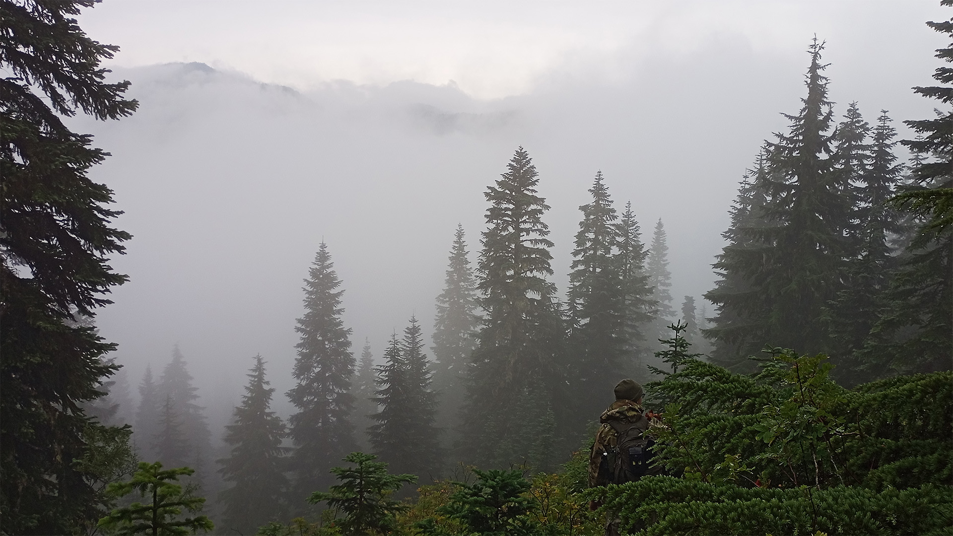
Index sits about an hour northeast of Seattle, where the Skykomish cuts through and the valley walls rise fast enough to keep the floor dark most of the day. I spent two days on the trails above town last September with a couple of buddies, tracking black bear. There was sign everywhere and no shortage of places to sit and glass from. I came home empty handed.
The bear got away with it. The color did not.

An Accent Color Needs Somewhere to Land
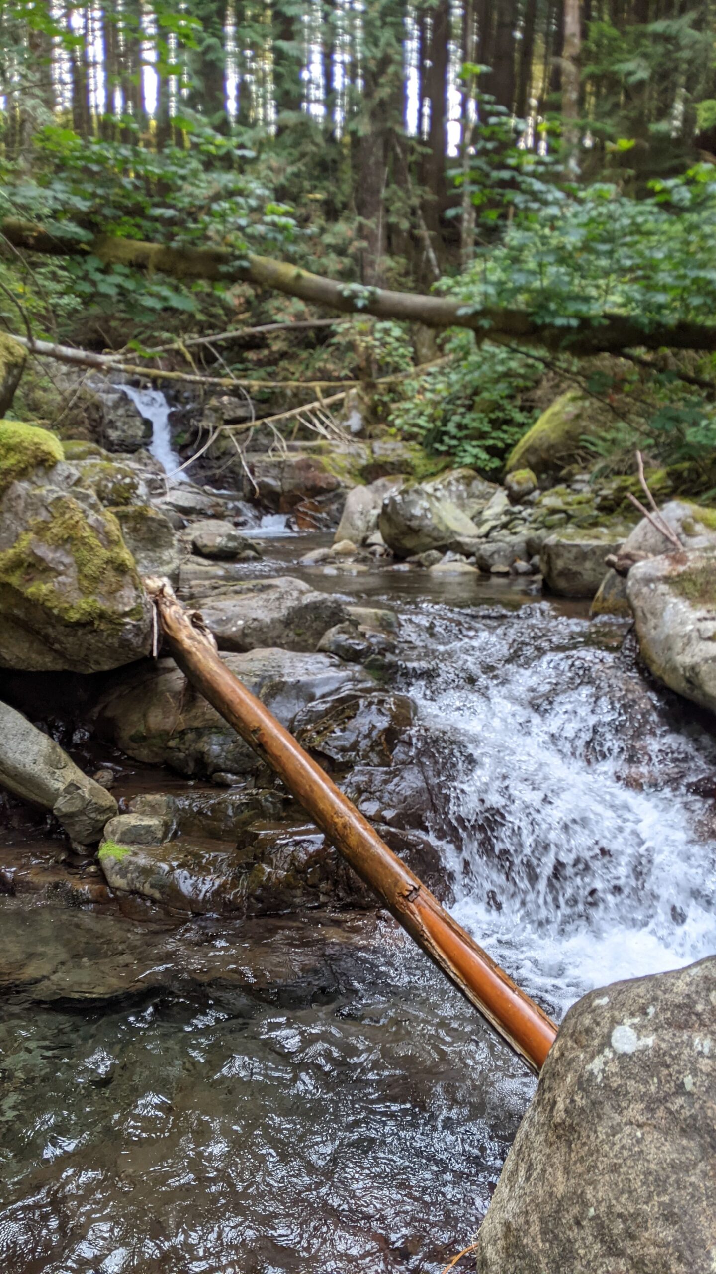
Scrolling back through two days of photos, the thing that stands out is how little actual color the Cascades hold in September. Conifers read blue-green in shadow and nearly black at distance. Moss on the creek boulders goes yellow-green where the light hits it and drops to grey a foot away. Granite is grey with a cool cast that turns near-black when wet. The bleached slash left behind in the cuts is a silver so pale it almost reads white against everything near it.
The one saturated thing in forty-eight hours was a blaze orange cap.
That cap does not work because orange is loud. It works because nothing else is. Drop the same orange into a scene that already has a red and a yellow in it and it becomes one more color competing for attention. Put it in forty miles of grey-green and the eye finds it instantly, from a quarter mile out, through brush. Hunters wear it for that exact reason, and it is the same mechanism every accent color in a brand palette runs on.
The Alder Files works from a field of evergreen, slate, and off-white with gold as the accent color, and the rule attached to that gold is that it never becomes a fill. The rule is not an aesthetic preference. It is the orange cap. An accent color stays an accent only as long as it stays outnumbered.
The Ridgelines Were Already in the Logo
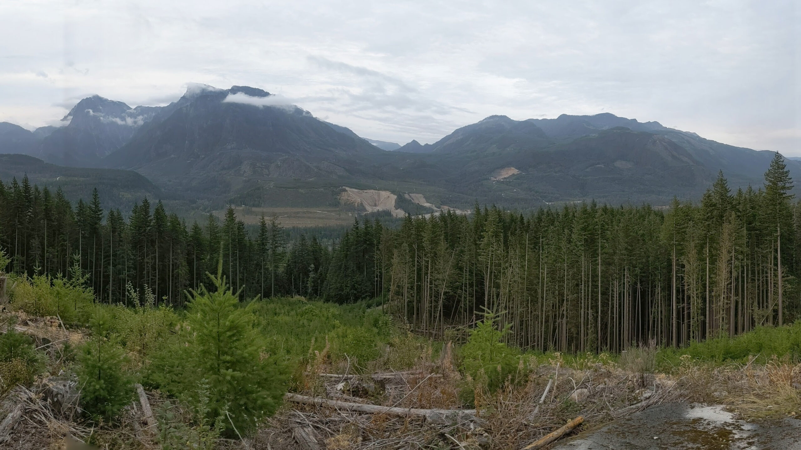
From a cut above the valley the ridges stack in layers: the near one dark and detailed, the next flatter and bluer, the one behind that barely separated from the cloud sitting on top of it. Nothing changes but value. No outlines, no shift in hue worth naming. Distance does all of the work.
That layered ridgeline runs through the site as a background motif, and standing in front of the real version explained why it holds up at small sizes. It is built entirely out of value steps. Strip the color out of a mountain range and nothing is lost. That is not true of most imagery, and it is why the motif survives being shrunk into a footer.
Repetition, at Scale
The best thing on the whole trip turned up at night, walking back toward camp behind a headlamp. A colony of puffballs ran the length of an old road cut. Hundreds of them, bone-white domes on dark wet duff, one form repeated at every size from marble to fist, the large ones forward and the small ones receding into black.

It is a single shape. All of the interest sits in the scale relationships and the spacing between clusters.
Designers reach for variety when a layout goes flat. The puffballs argue the other way. One form, repeated across a deliberate range of sizes, with real room between groupings, holds attention longer than five forms competing for it. That is a type scale. That is a spacing system. It is the logic underneath any modular identity: one mark, a defined set of sizes, and discipline about what sits in between.
Where This Already Works
Filson, up the road in Seattle, has run this palette for more than a century. Tin cloth tan, olive, oxblood, with brass hardware doing the accent work. The brass is the orange cap. Danner holds a similar narrow earth range and lets stitching and a single red tab carry the signal. Neither brand raises its voice. Both are unmistakable at thirty feet.
More interesting is who is not using it. Trades that work outdoors — timber, excavation, land clearing, arborists — almost all default to high-contrast safety colors across an entire identity, and end up indistinguishable from one another. Outfitters and guide services do the same. A low-chroma field with one disciplined accent color would separate any of them from a category that currently reads as a single beige-and-orange blur. The same holds for a regional distillery, a coffee roaster, a builder: anyone whose product should feel durable rather than urgent.
What to Look For
The exercise works anywhere. Squint until the detail drops out and count how many colors are actually doing something. It is usually fewer than expected. A field, a mid-tone, and one thing that interrupts. Then notice what the interrupting thing is, and how little of it there is.
I went up there to find a bear. What came back down was a reminder that restraint is not a style. It is a mechanism, and it works whether or not anyone designed it.